YUM YUM
The Context
YumYum grew from the founders’ childhood memories of homemade juices, made with fruit picked straight from their family gardens. Years later, they wanted to bring that same simplicity and honest approach to a new generation of natural juices.
Our challenge was to translate those roots into a contemporary brand, one that could feel natural and approachable without looking rustic or predictable.
The Solution
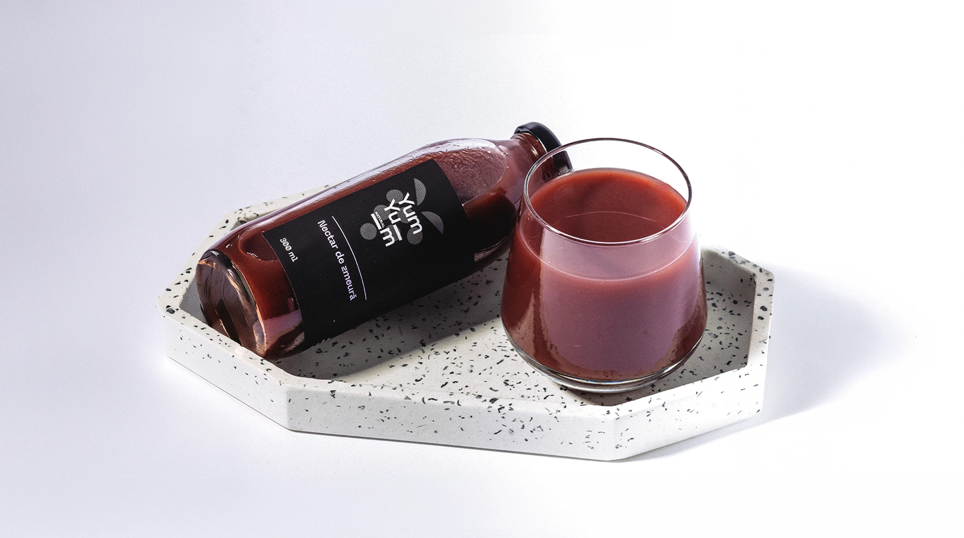
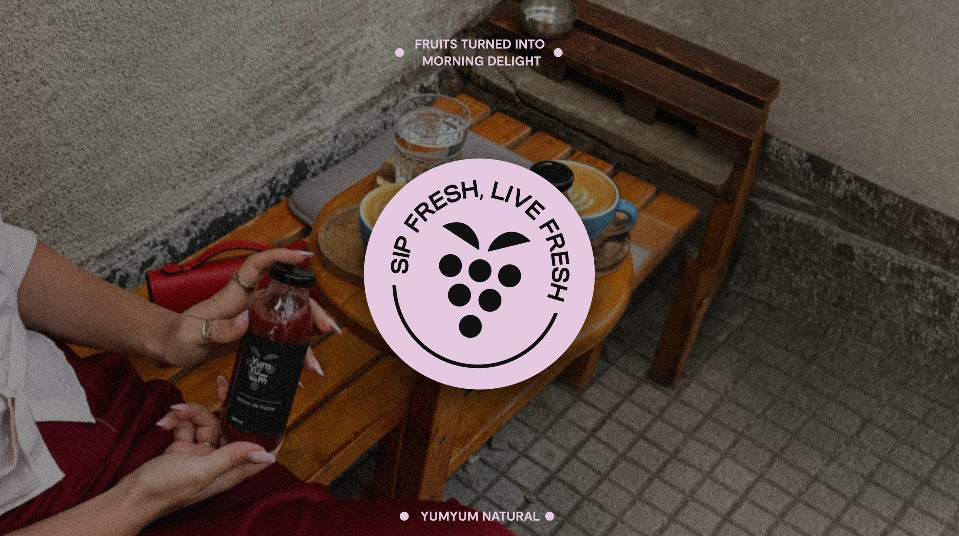
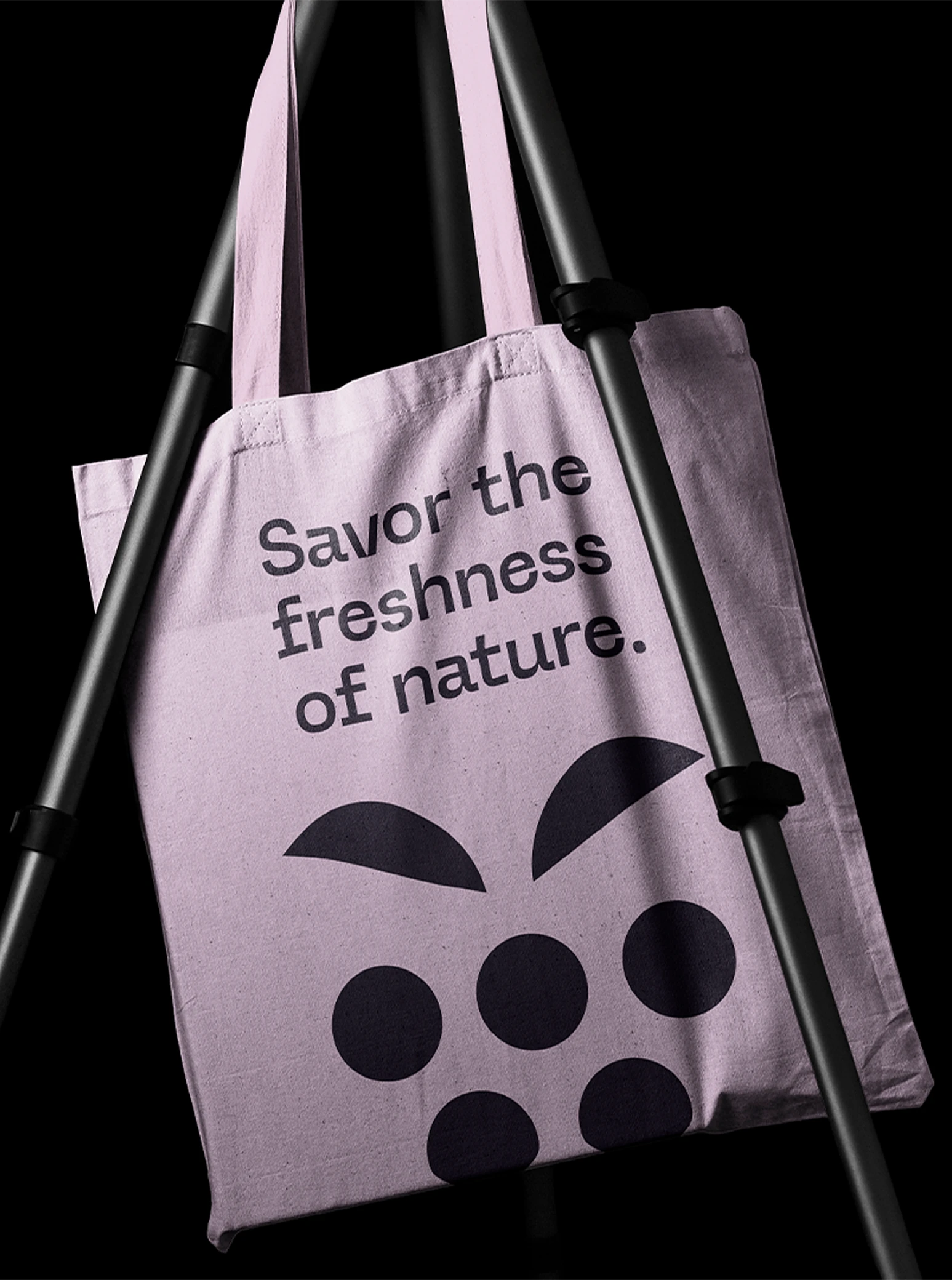
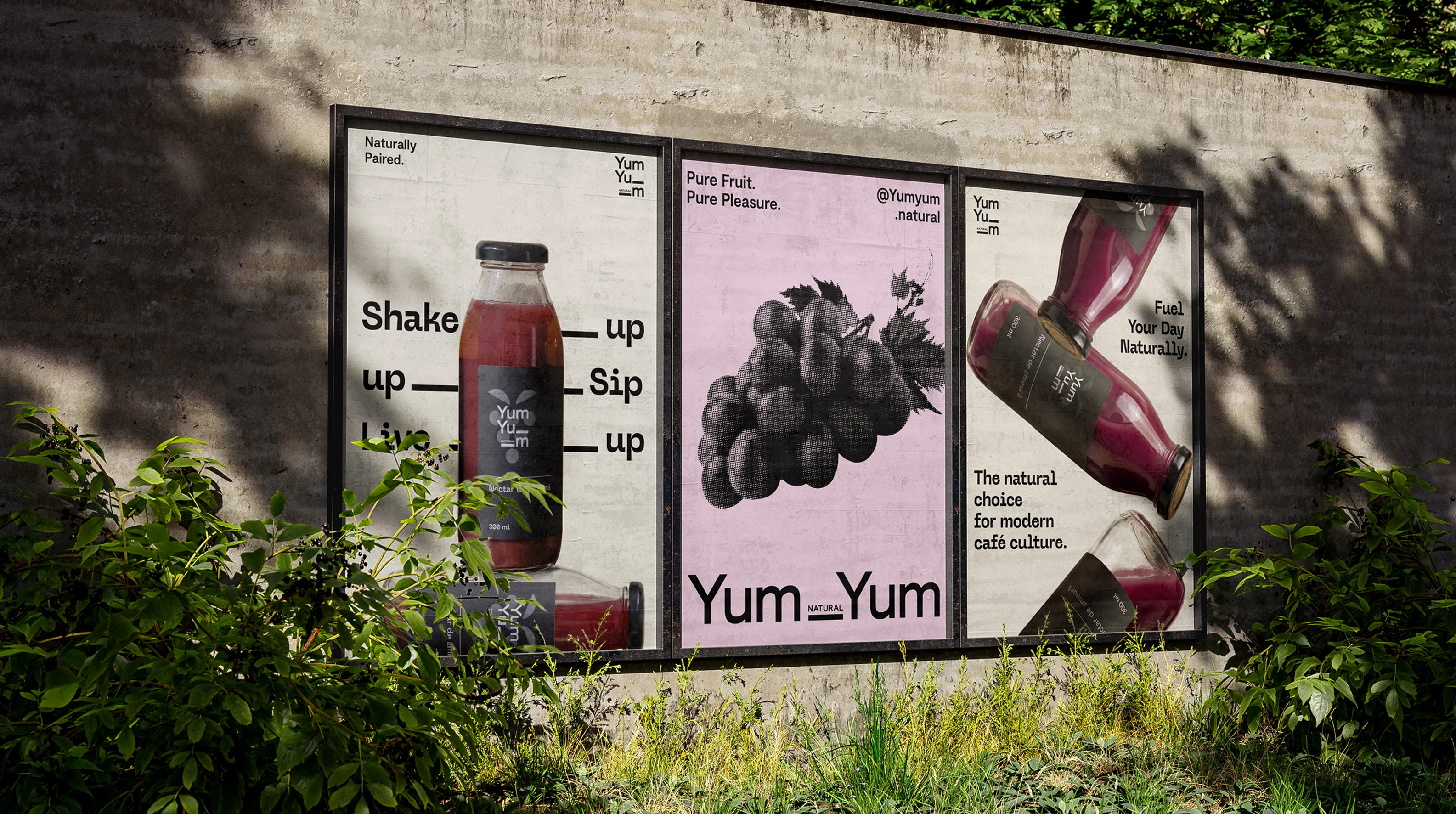
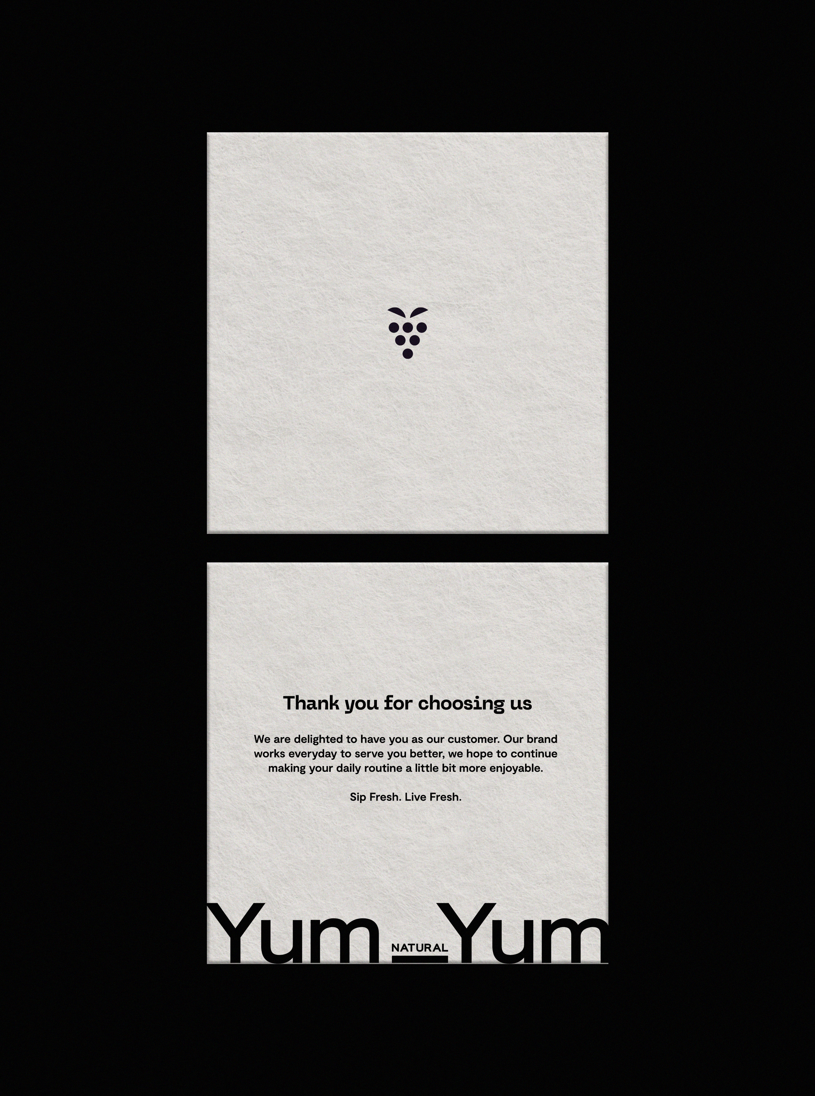
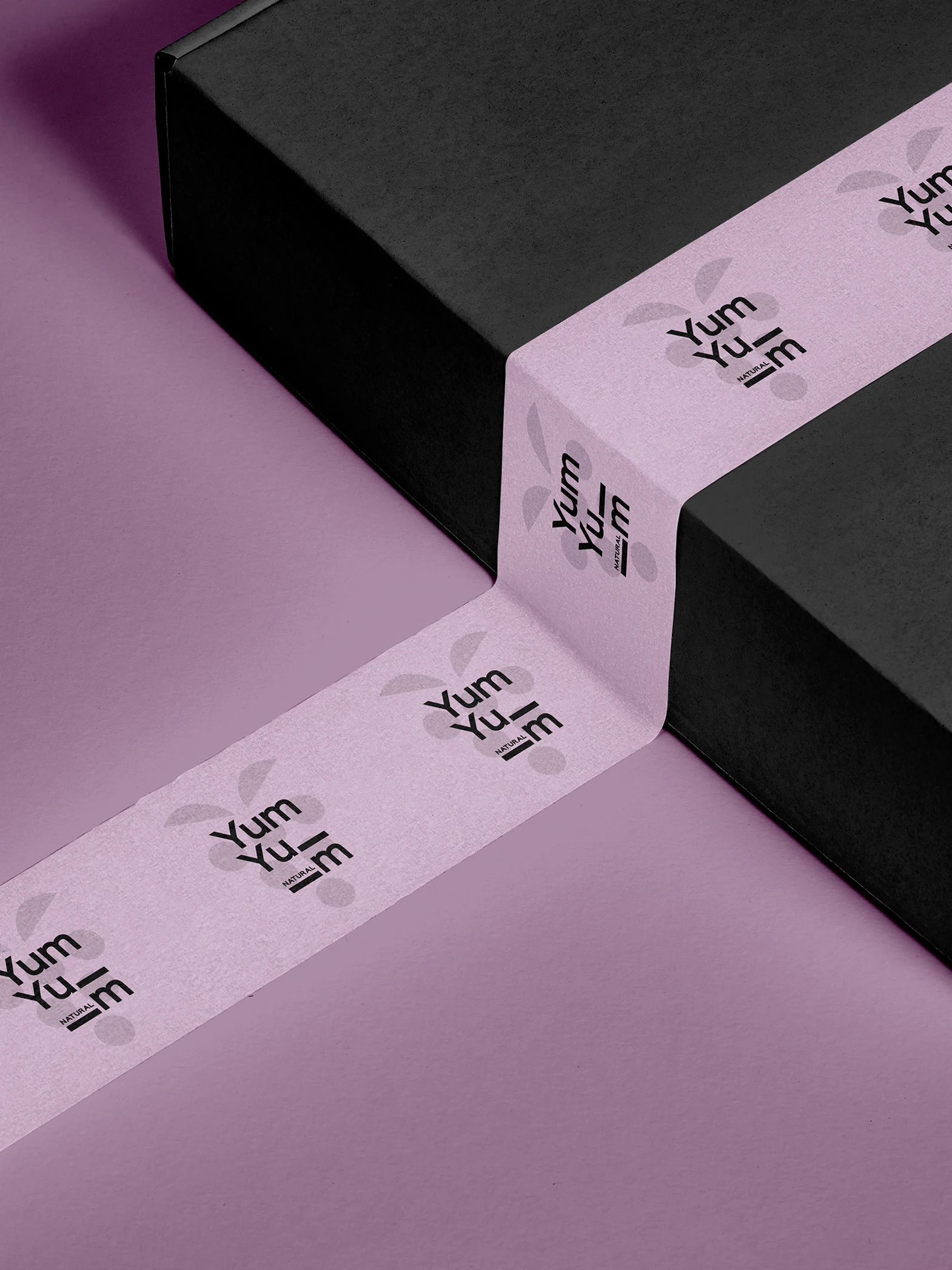
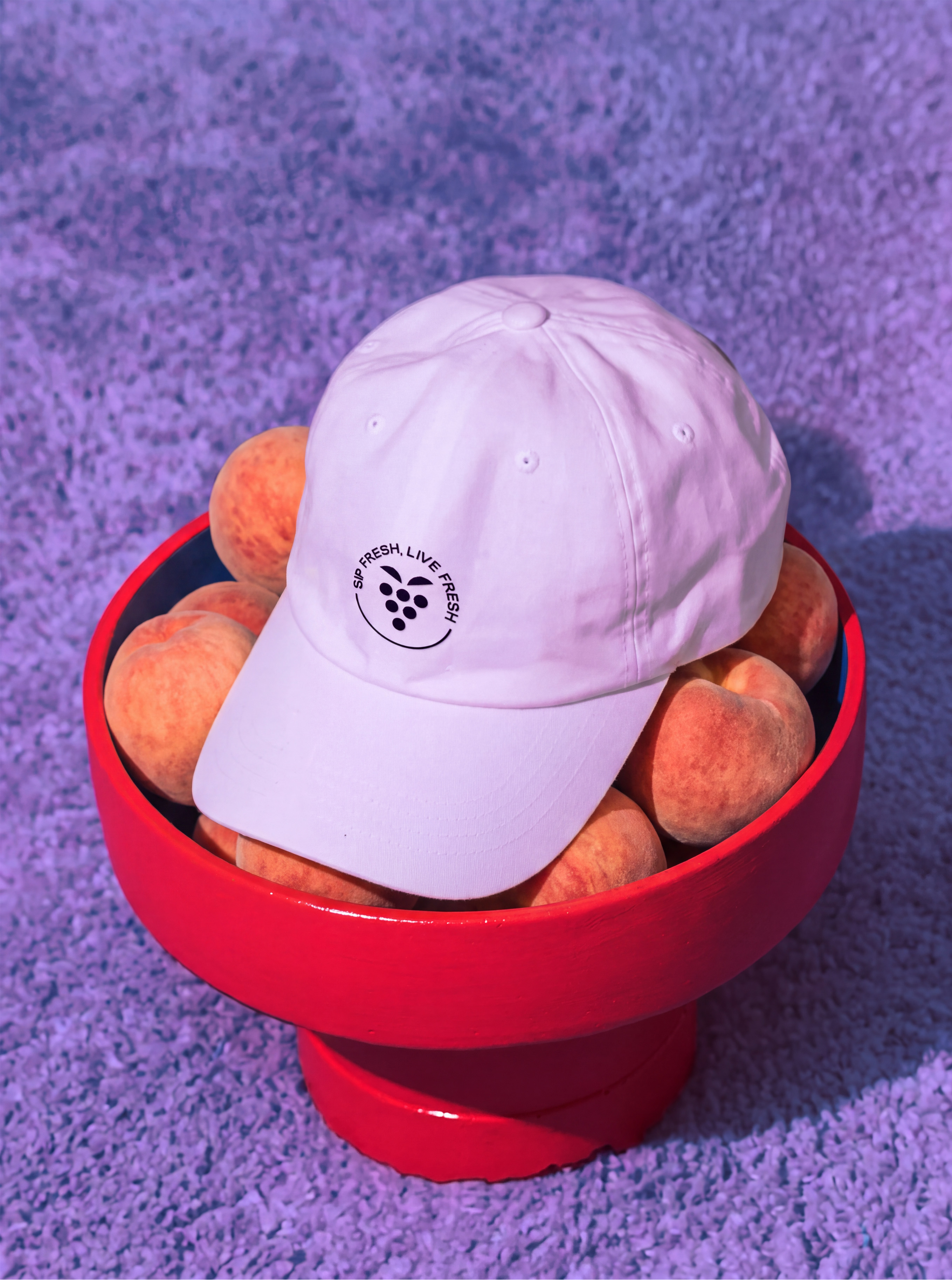
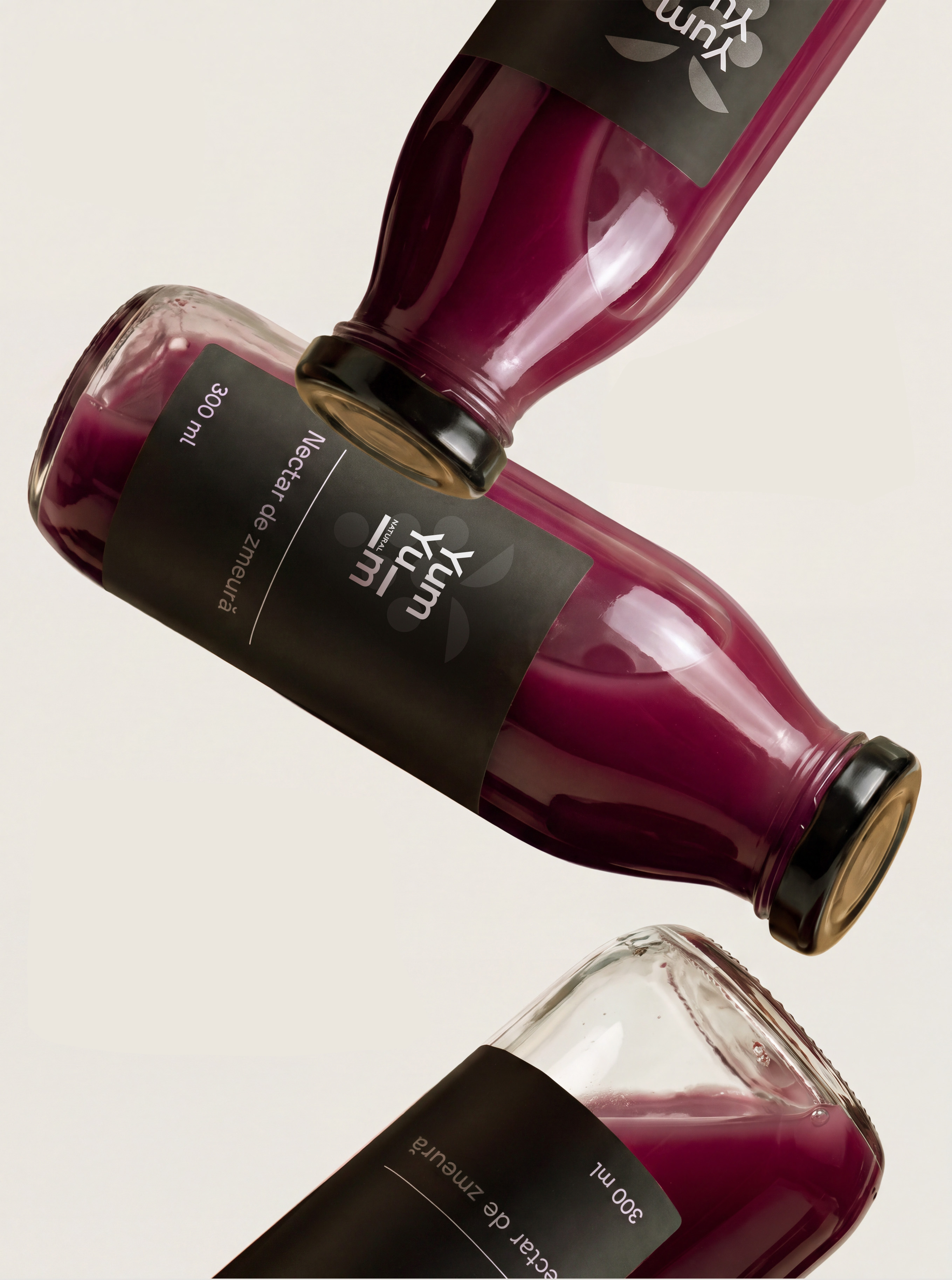
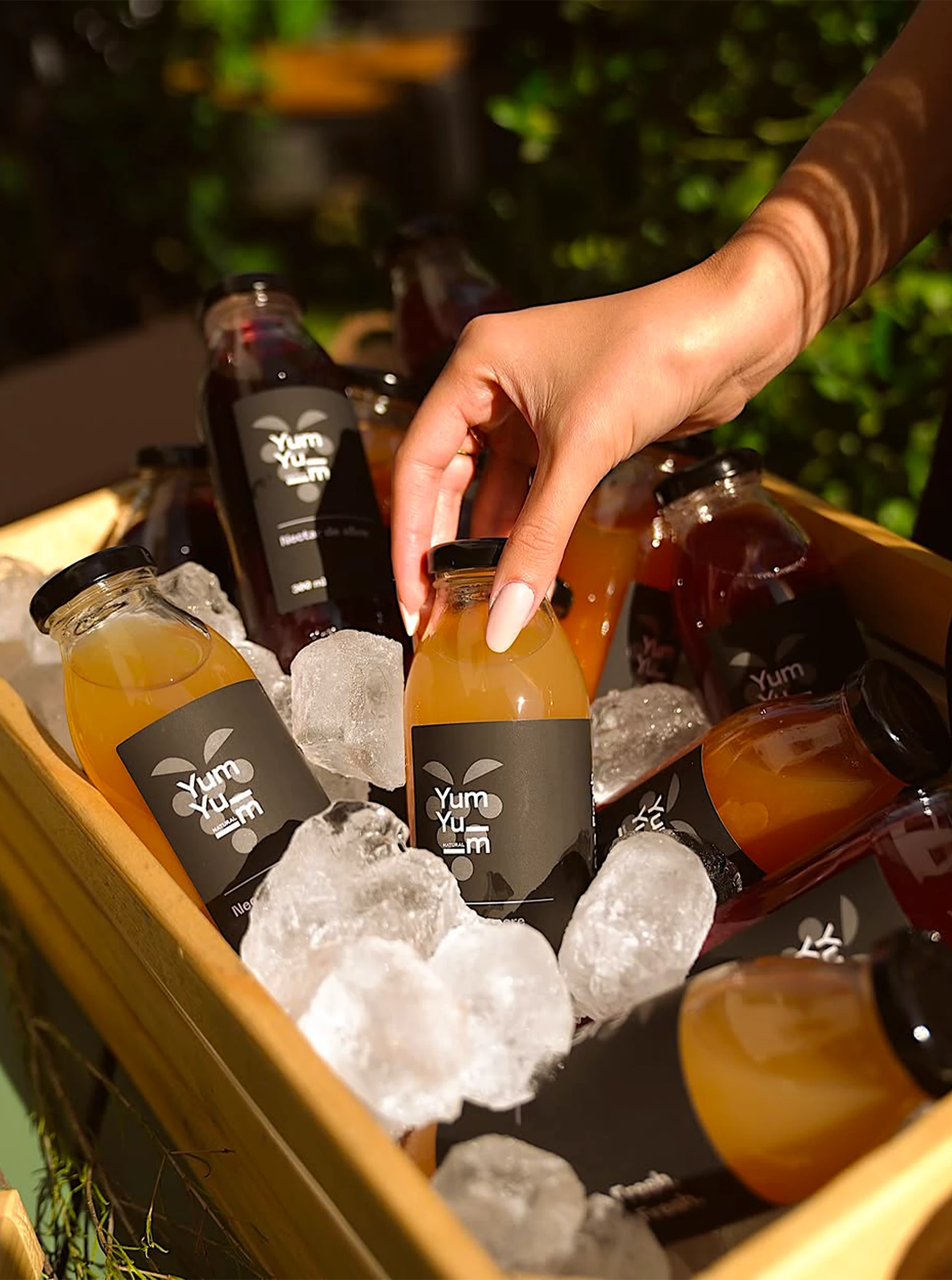
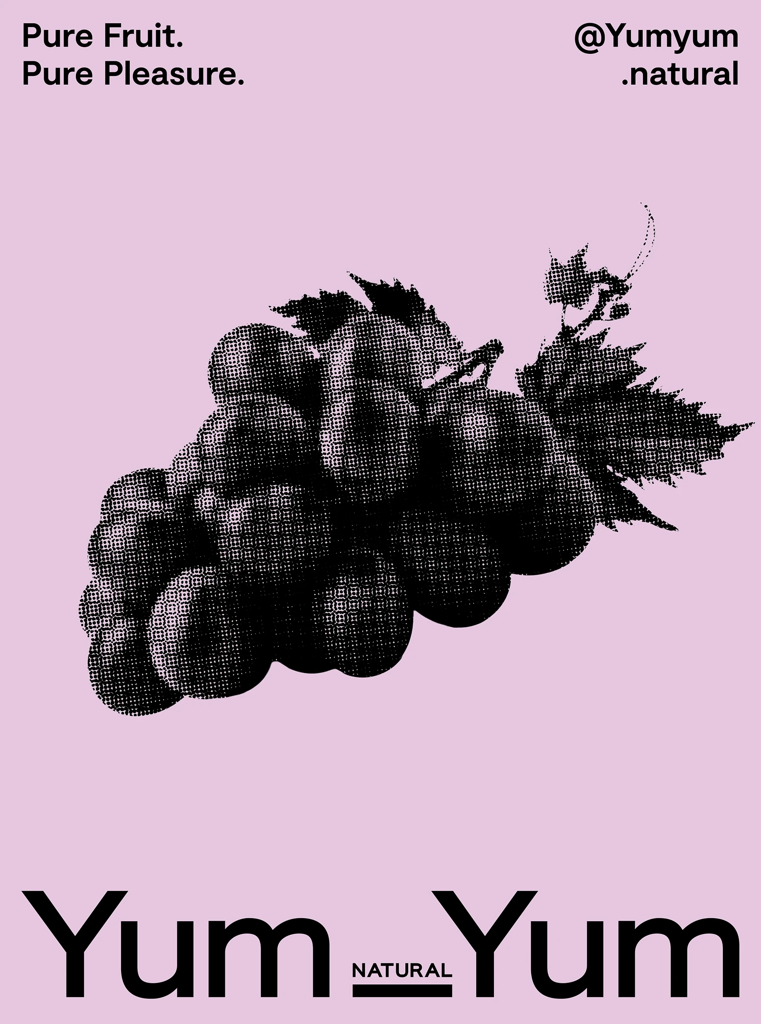
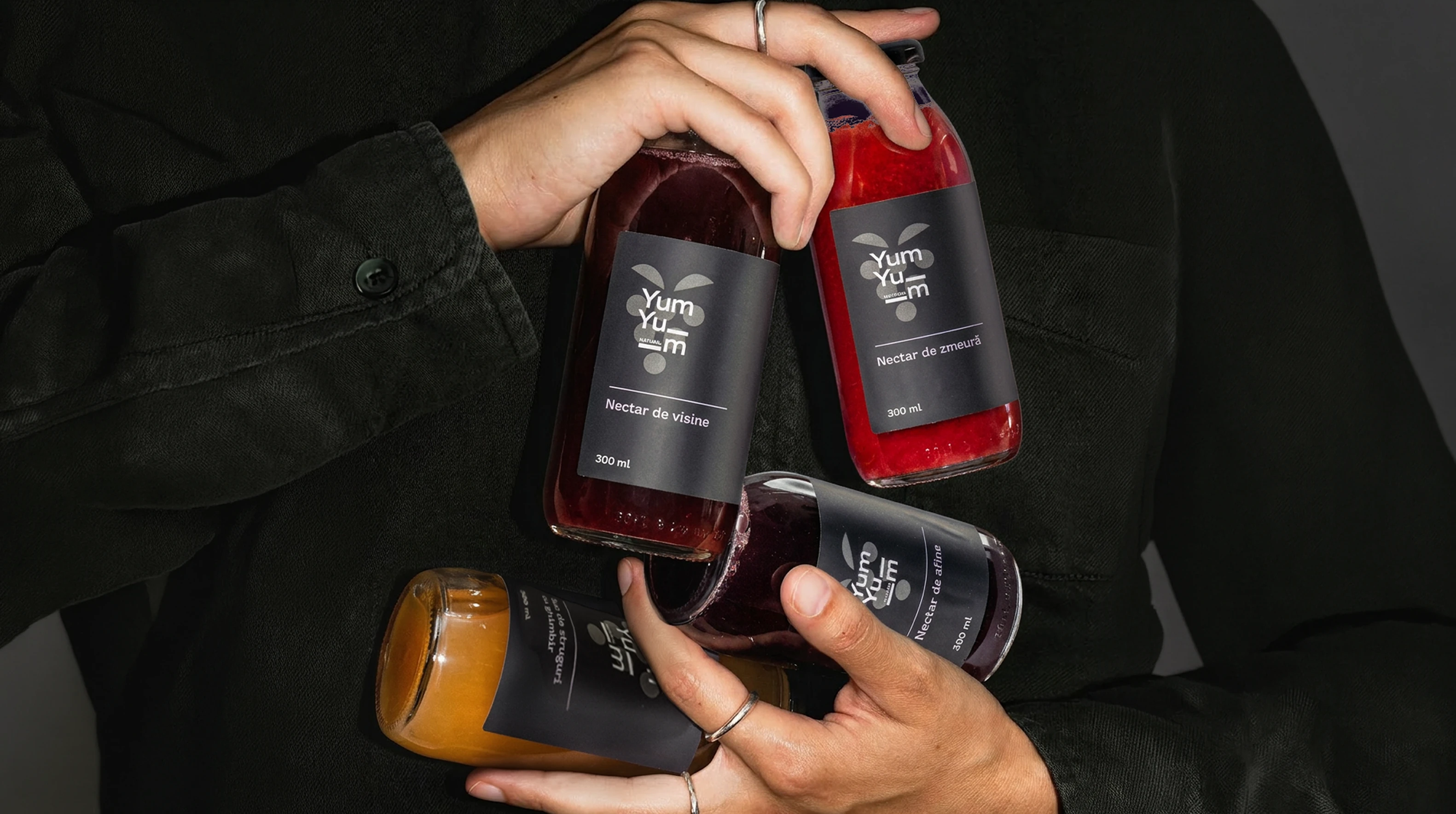
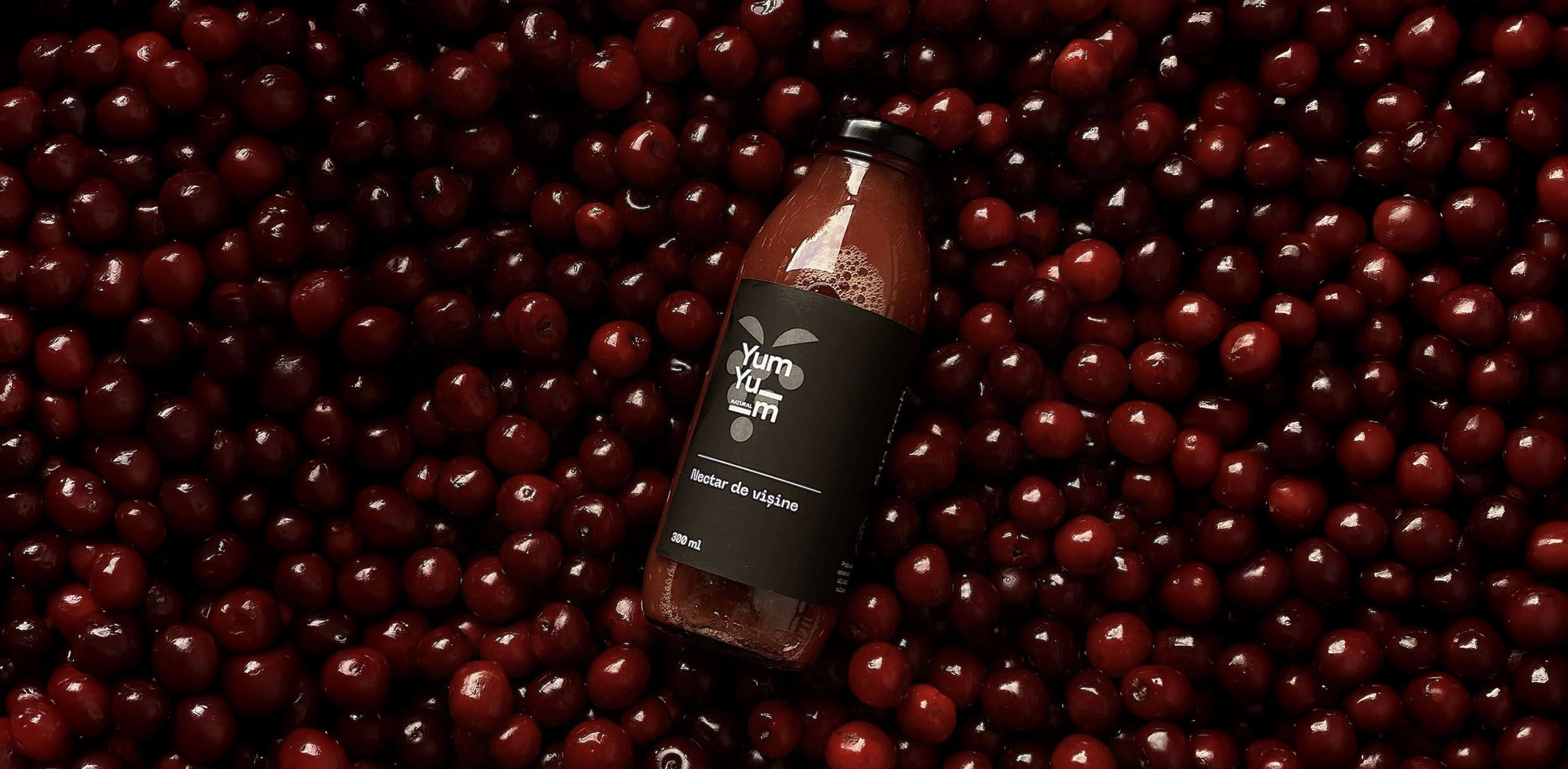
One detail gave us the starting point for the entire identity: every YumYum recipe uses grape juice as its base, no matter the flavour. We turned that constant into the brand’s most recognizable element, creating a Y-shaped mark that also reads as a simplified grape.
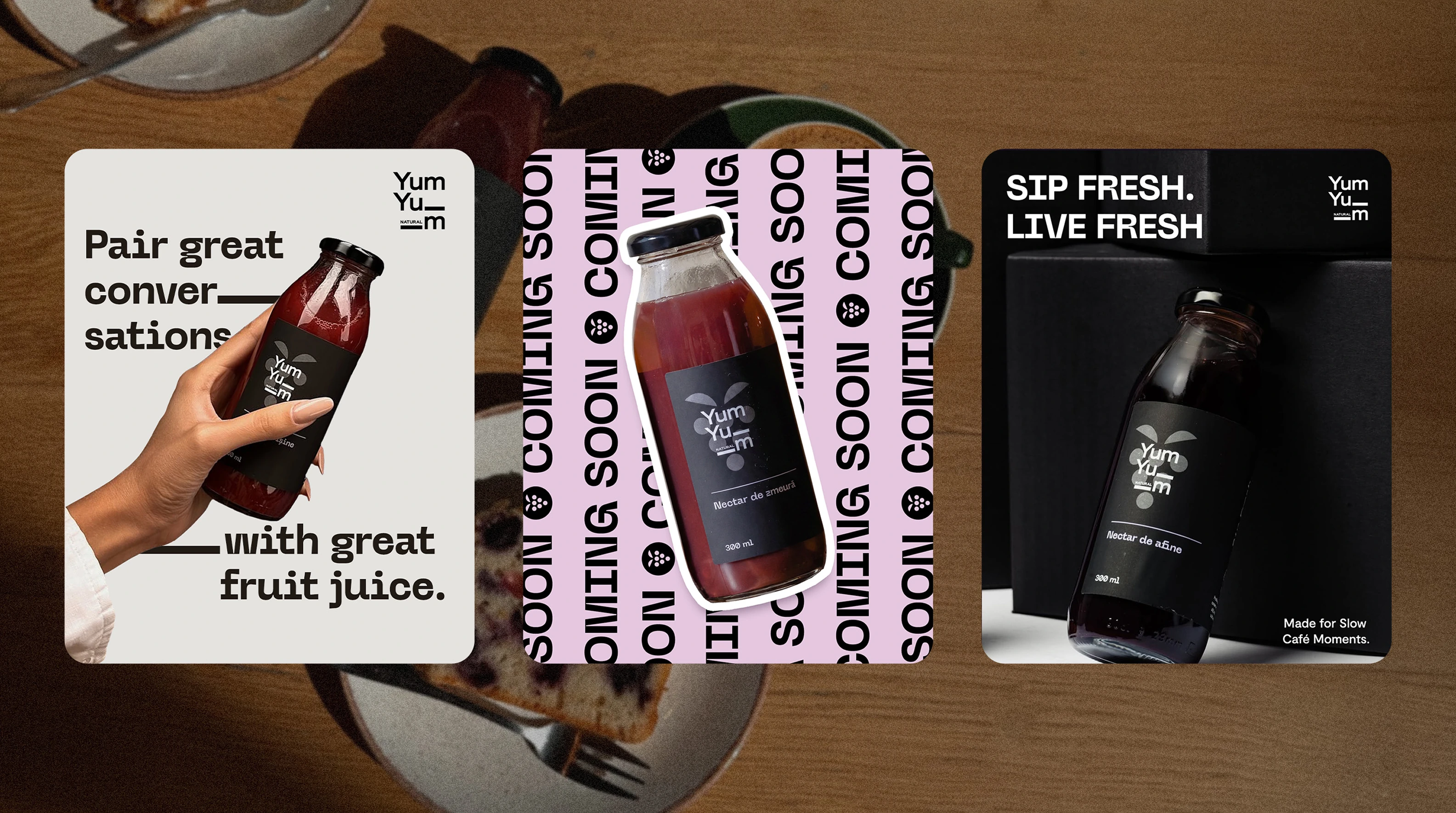
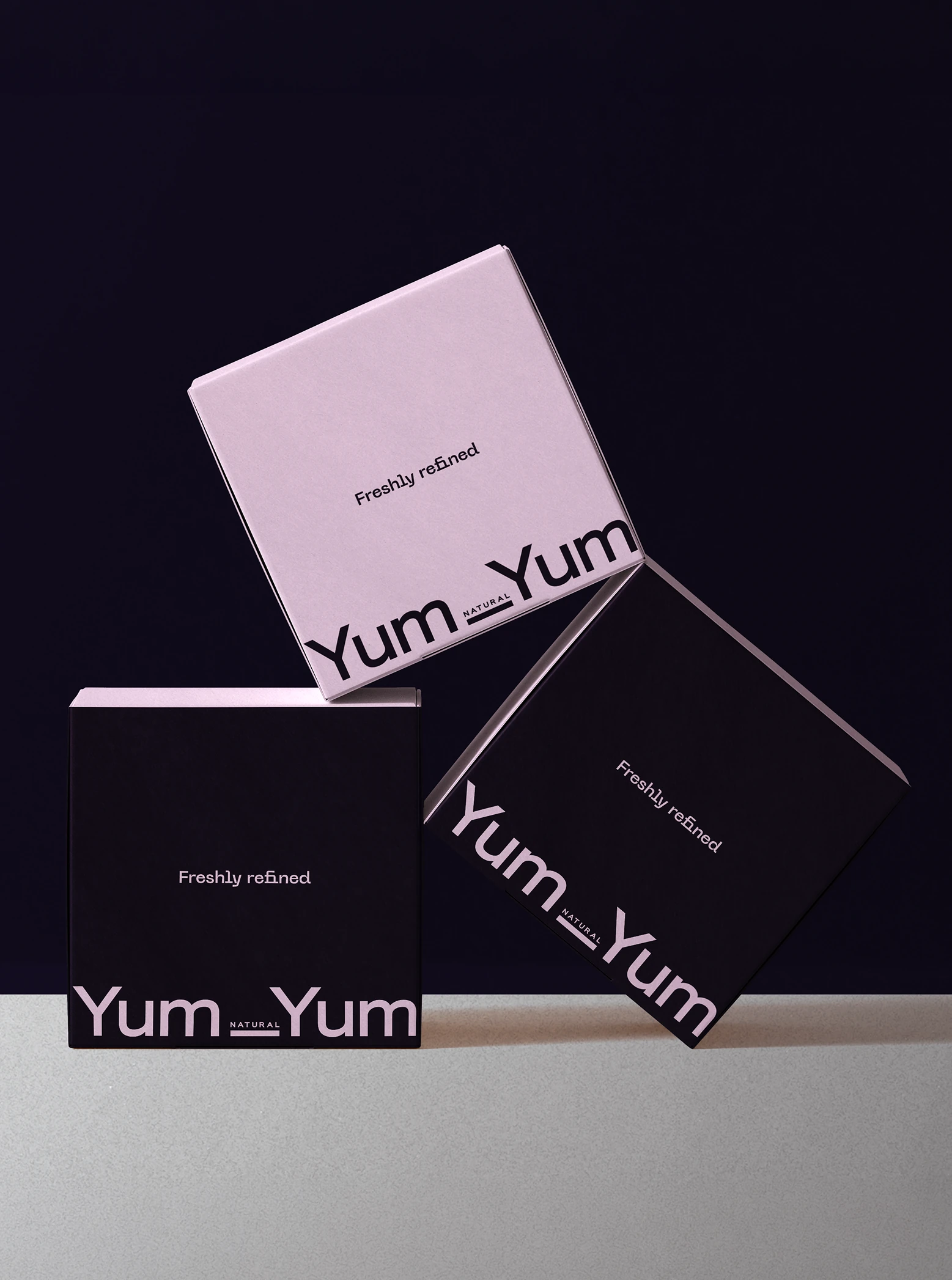
The rest of the identity was designed around the same idea of simplicity. A restrained visual system, distinctive typography and a refined colour palette give YumYum a contemporary feel while keeping the ingredients and product at the centre. The result is a brand that feels fresh and considered, with enough flexibility to live across packaging, digital and everything in between.