.png)
HeyGluco
The Context
HeyGluco was born from a family’s own experience with type 1 diabetes. After their daughter Ecaterina was diagnosed at seven, they found themselves navigating a new reality filled with medical information, calculations, uncertainty and a lot of fear. What they needed most in those first months wasn’t more information, but a clearer, more human way to make sense of it.
They decided to create the resource they wished they had from day one: a place where families could learn, find practical tools and feel supported by people who had already been through the same experience. Our challenge was to turn that deeply personal idea into a brand that could talk about a serious subject with clarity and empathy, without feeling clinical or intimidating.
The Solution
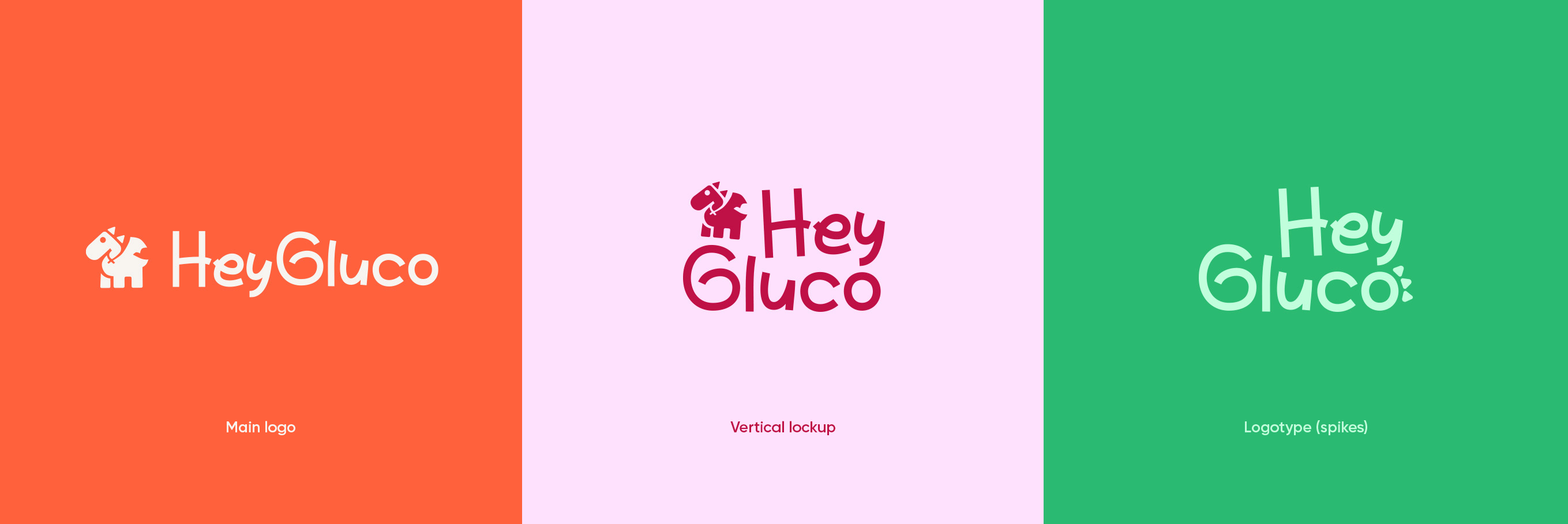
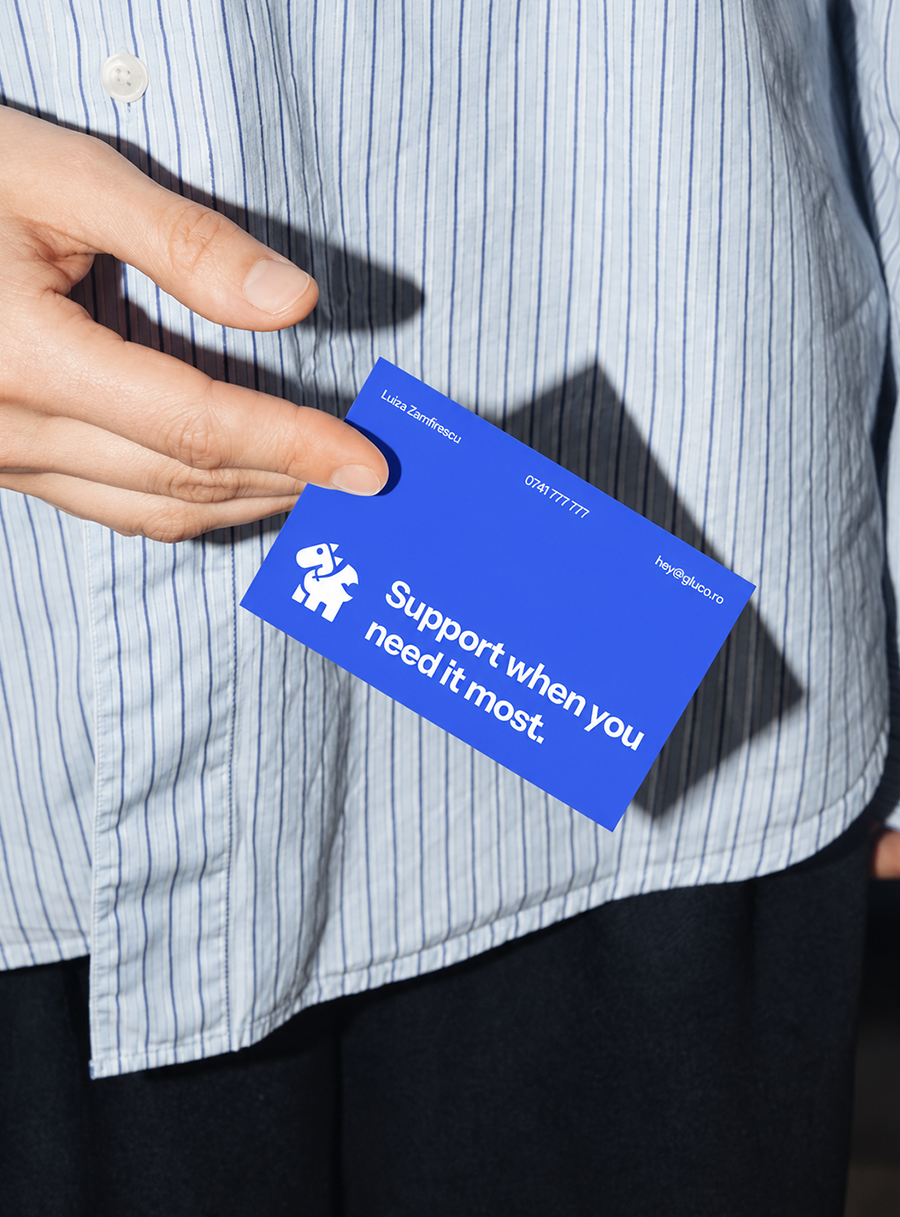
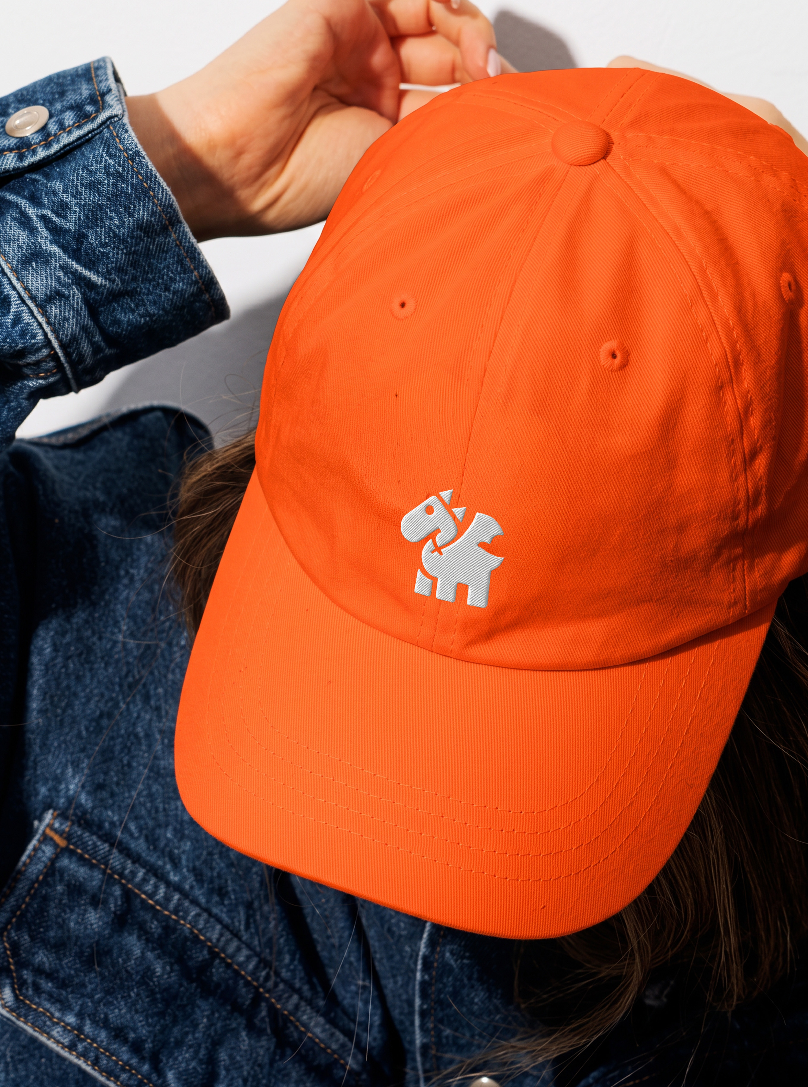
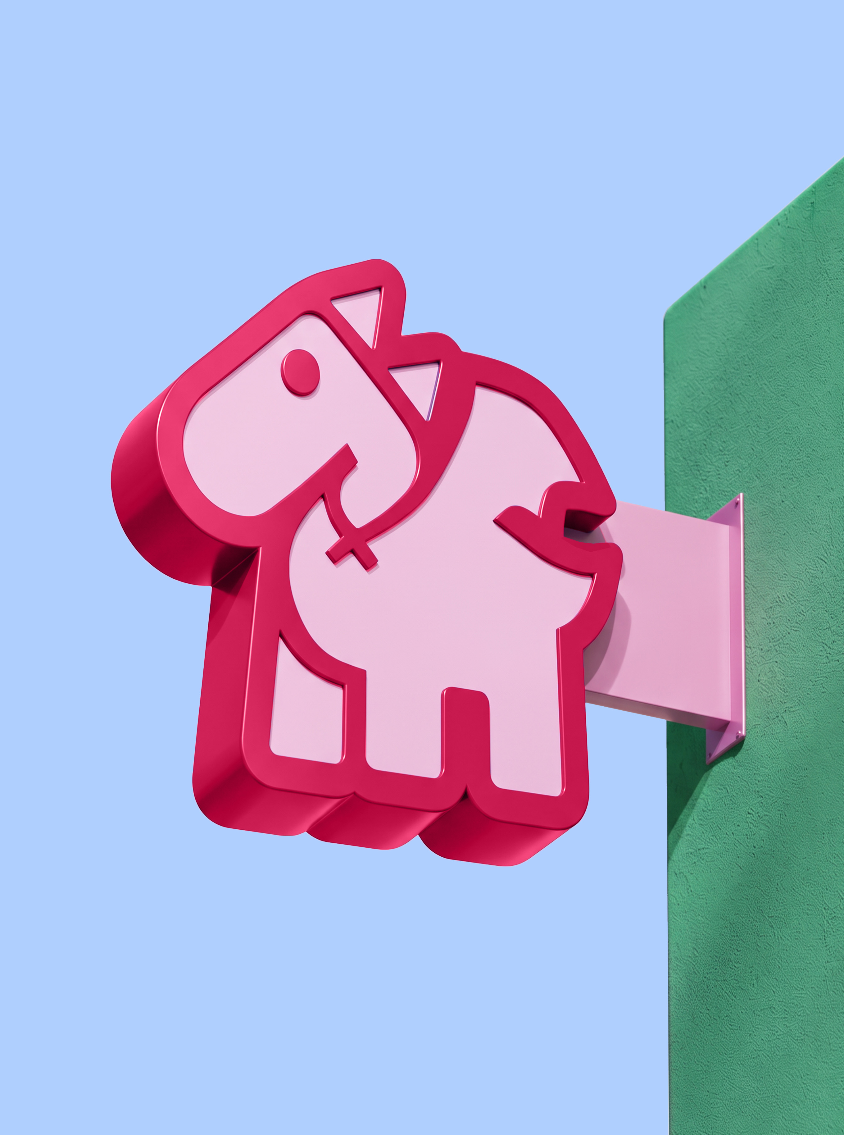
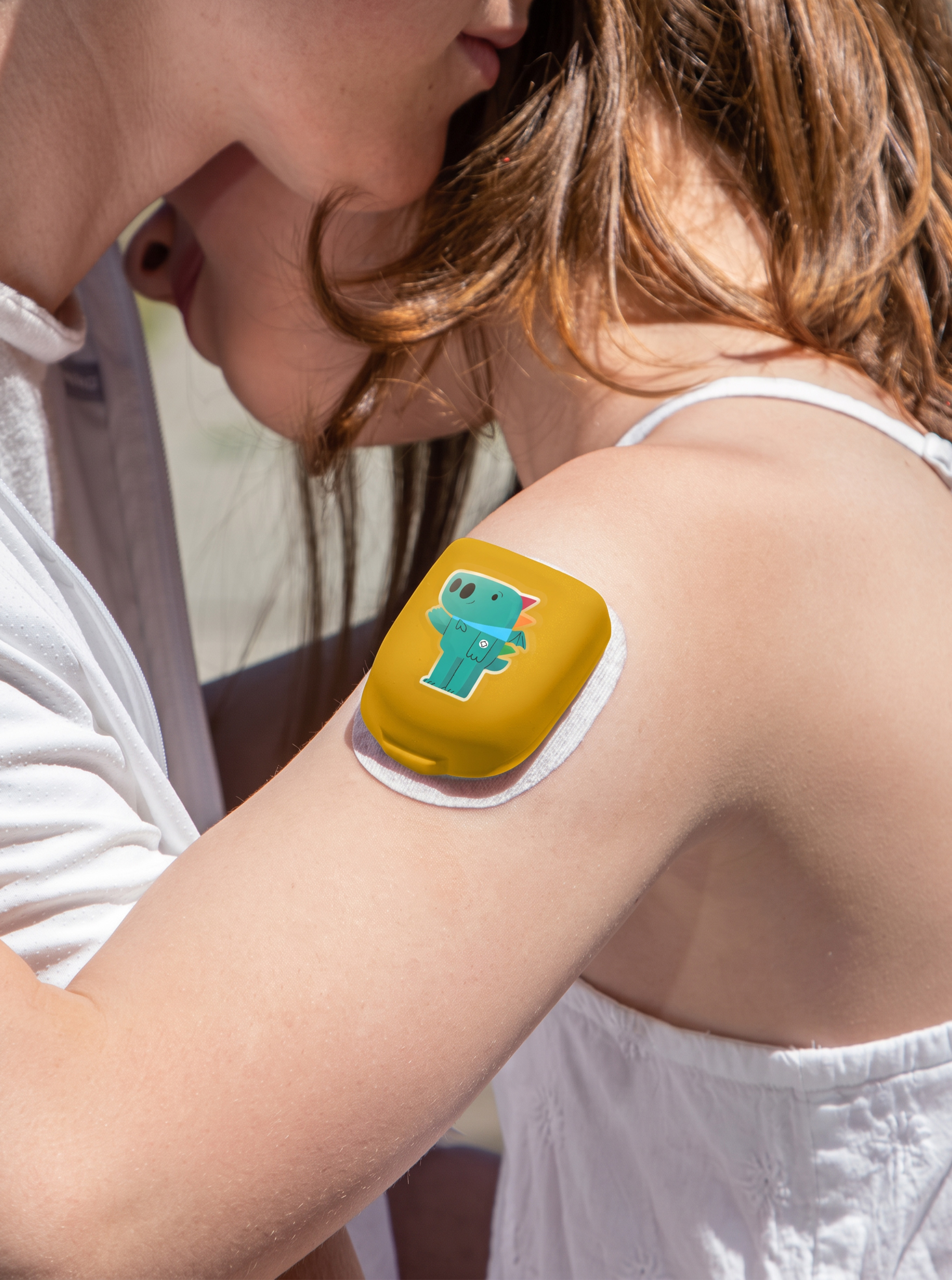
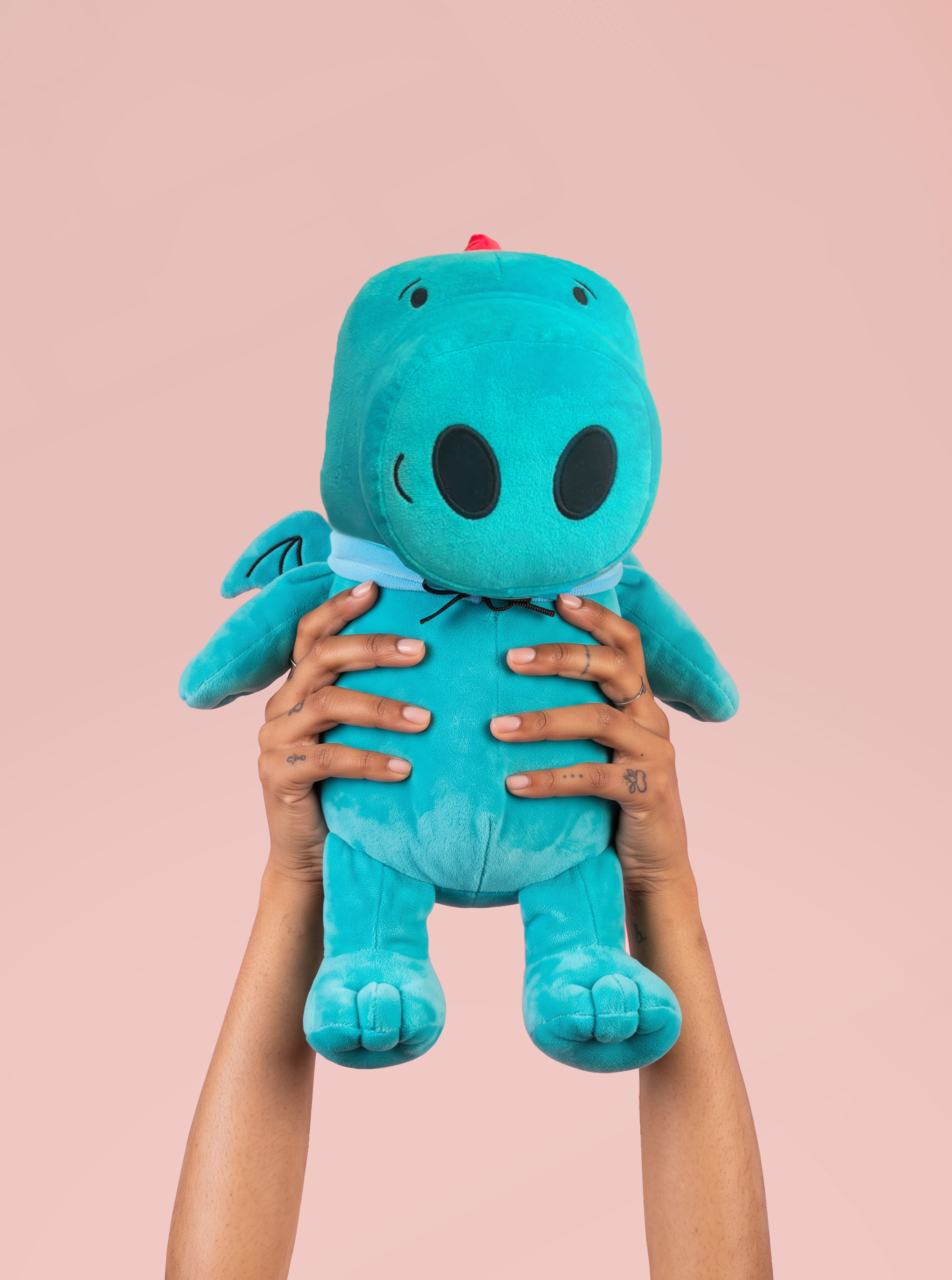
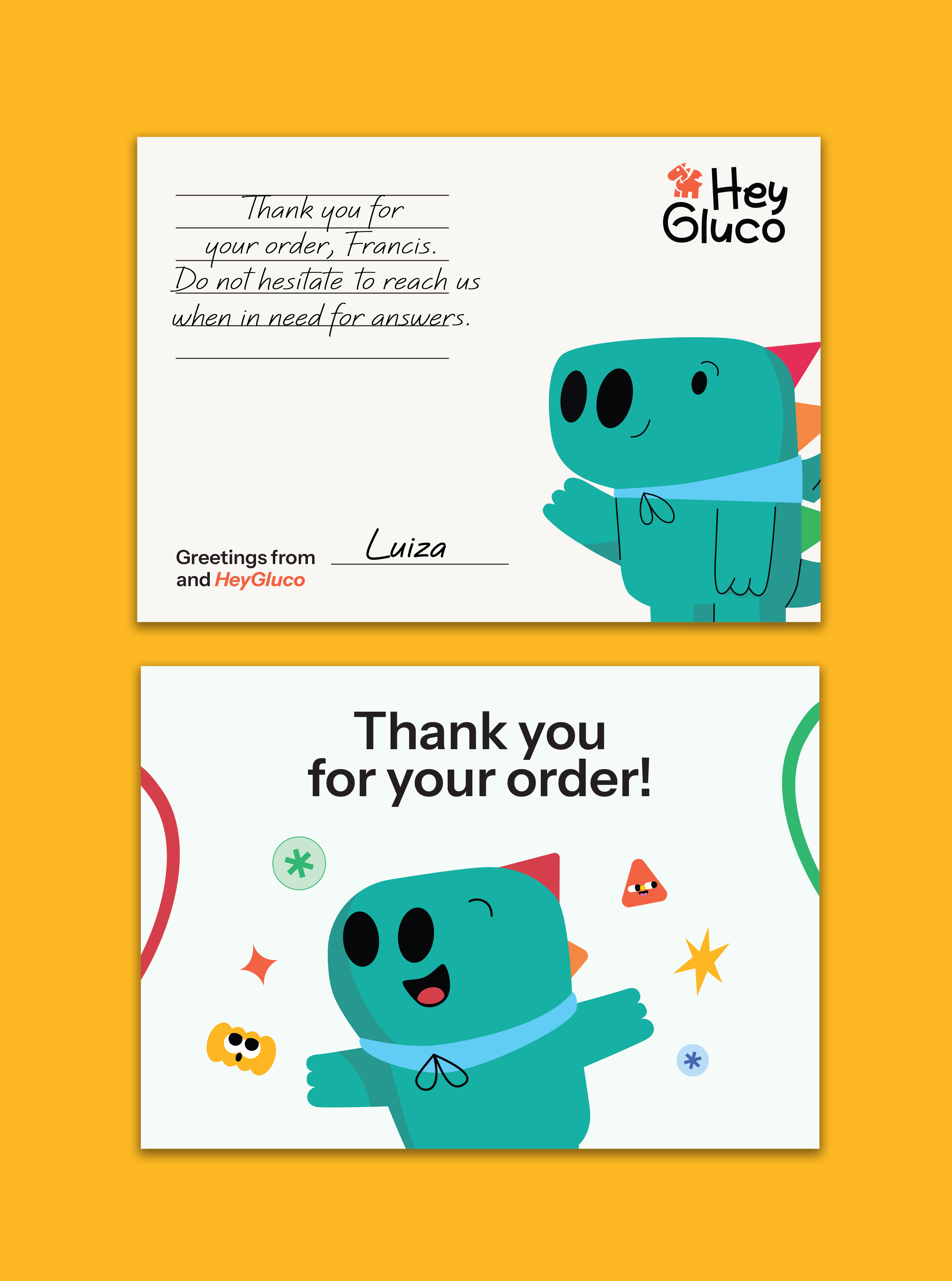
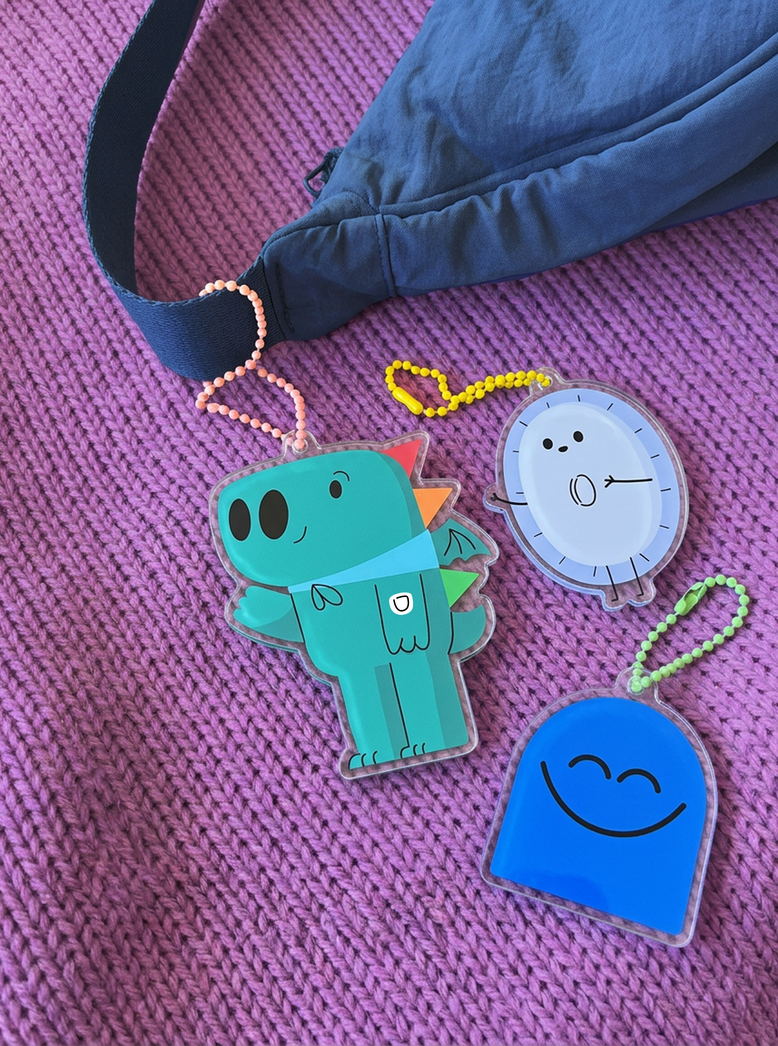
We built HeyGluco around the idea of making diabetes easier to understand and less frightening, especially for children. At the centre of the identity is Gluco, a small dragon designed as a familiar companion through a world of sensors, insulin, glucose levels and new routines.
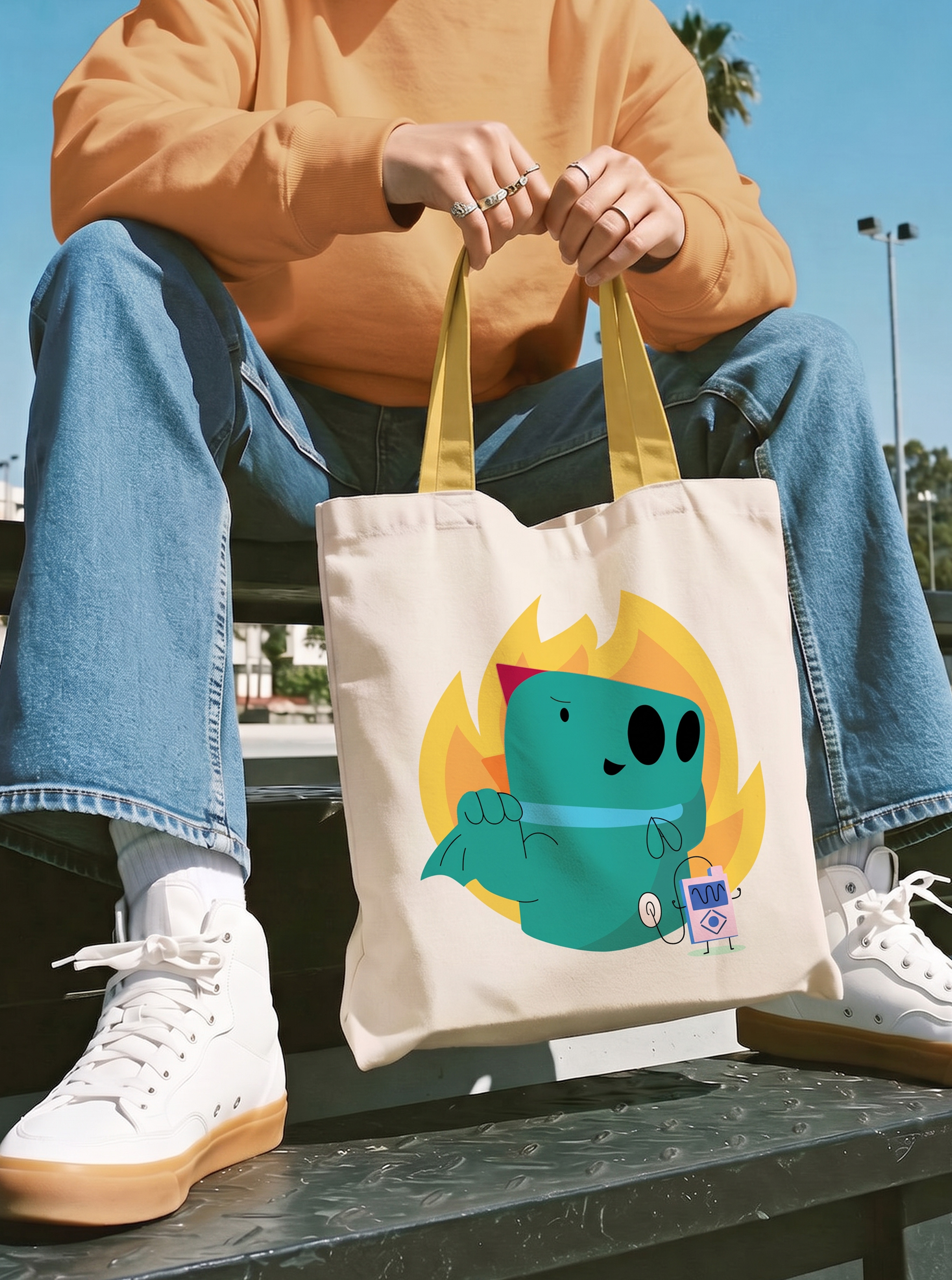
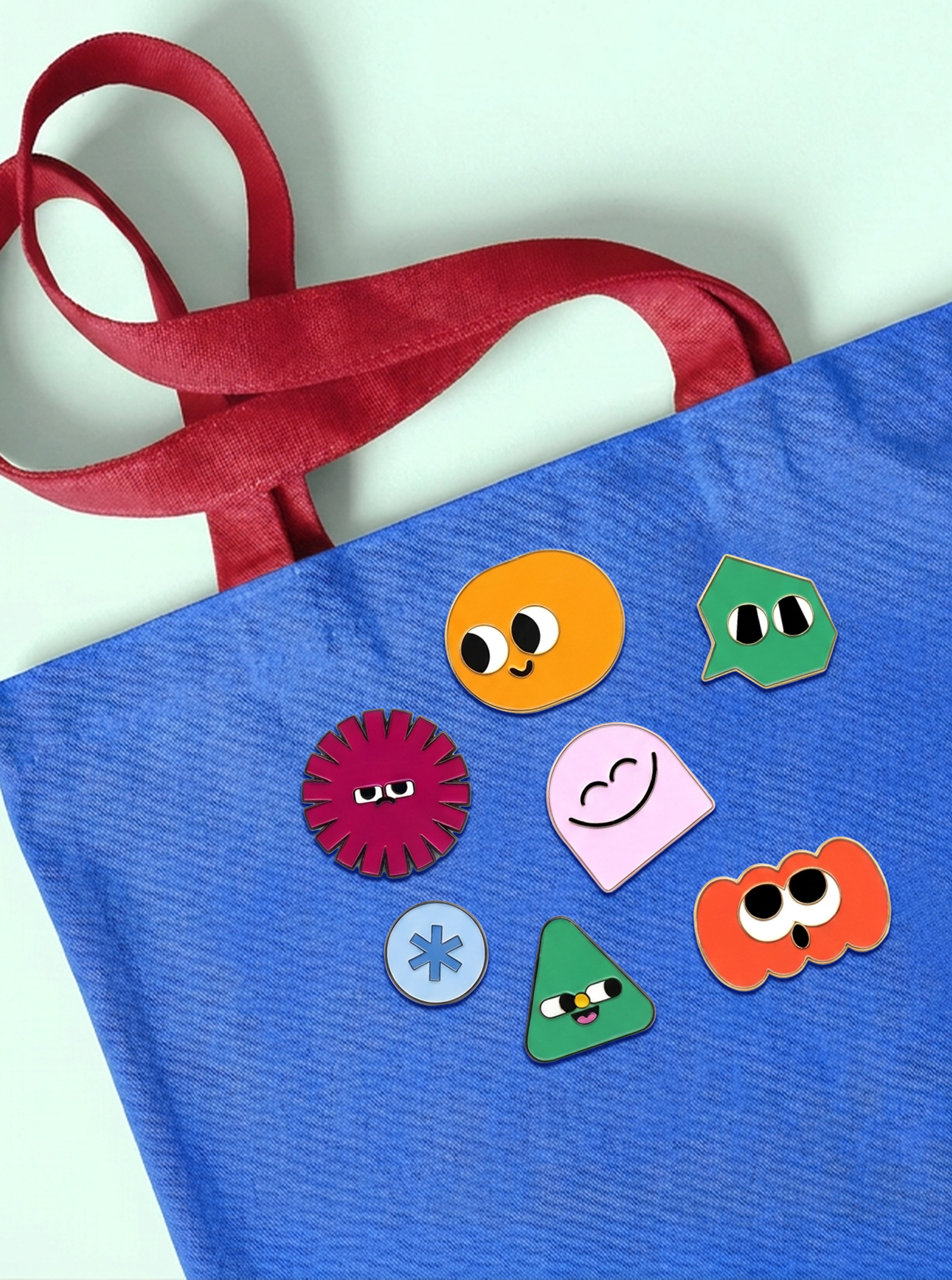
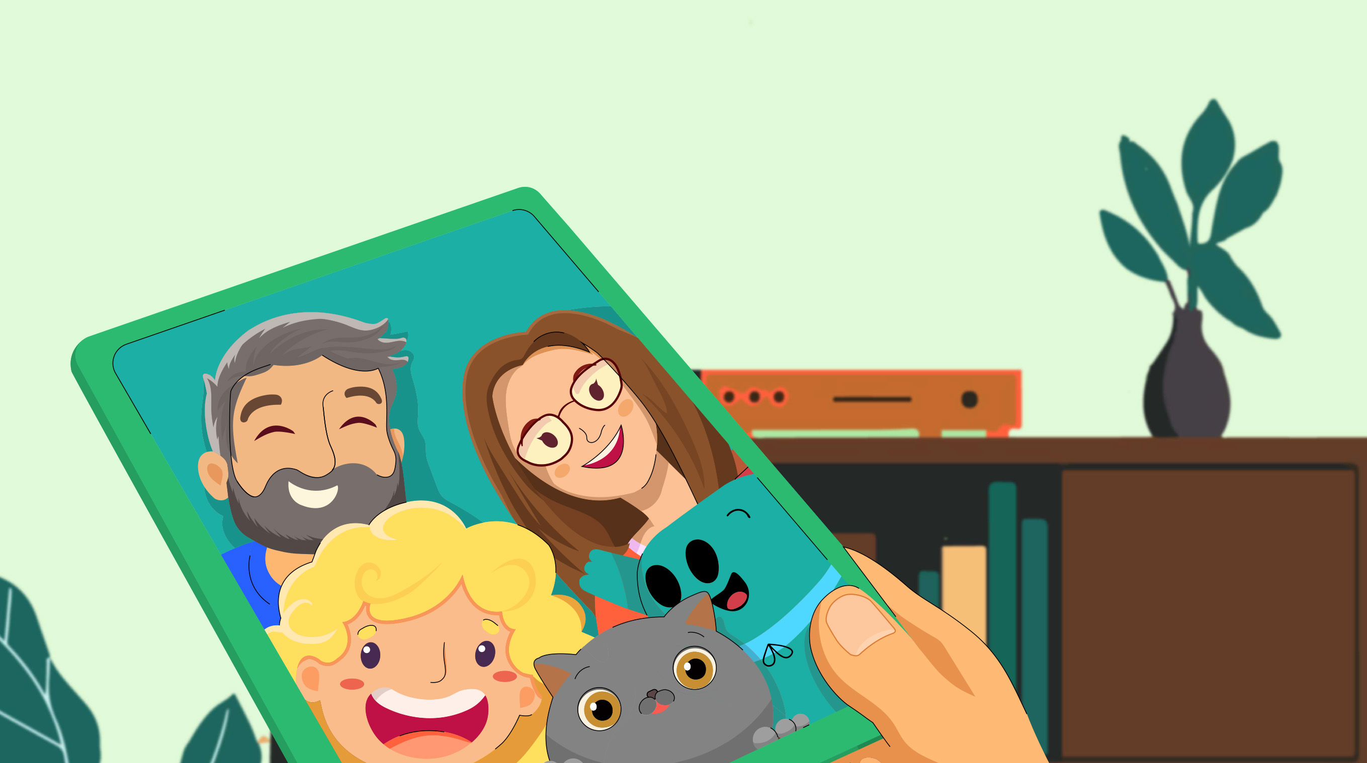
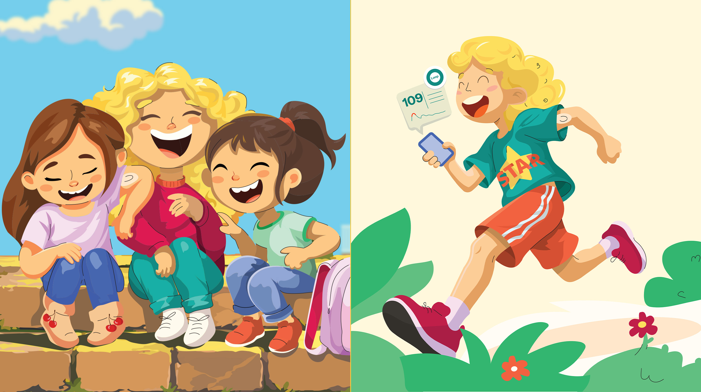
Every detail has a purpose. His three coloured spikes reference glucose levels, while the scarf is inspired by the international symbol of diabetes. Around him, we created a cast of characters based on everyday diabetes tools, turning unfamiliar medical objects into something children can recognise and relate to. A second, more narrative illustration style helps tell the family’s real story with more emotion and nuance.
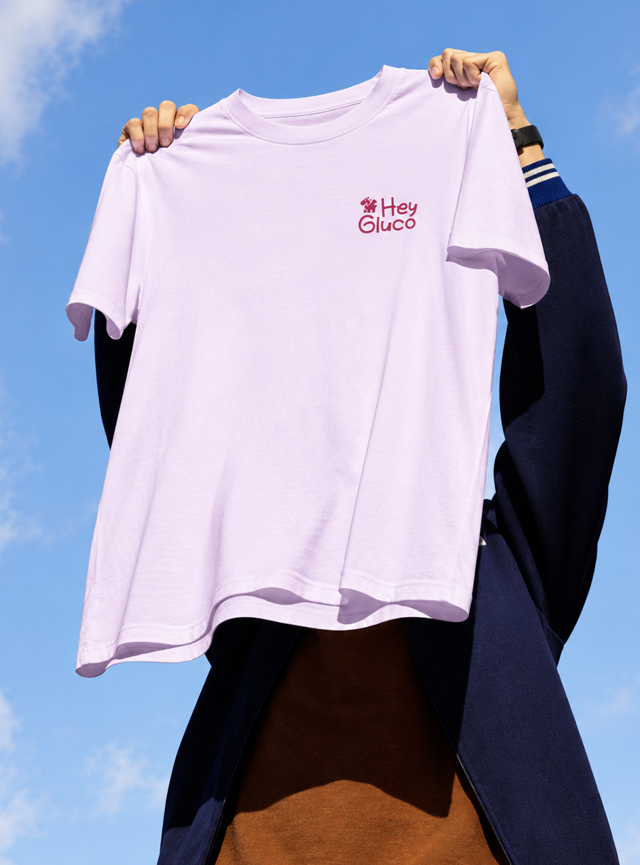
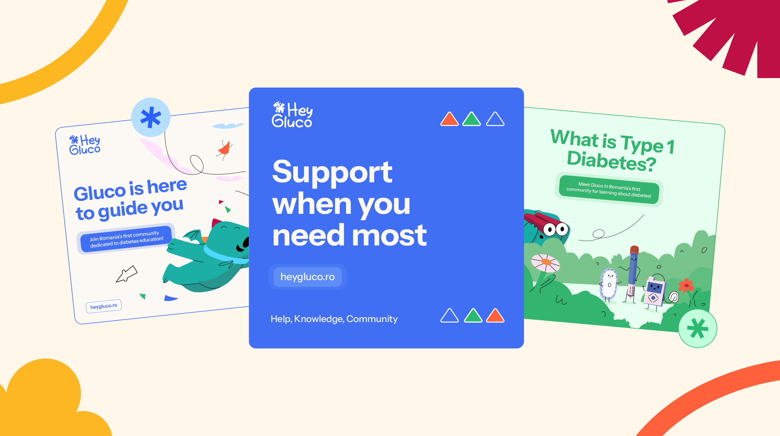
A warm, colourful palette moves away from the cold visual codes of healthcare, while typography and a clear editorial system make complex information easier to navigate. Together, they give HeyGluco a visual language that can educate without overwhelming and support without talking down.