MERCI
The Context
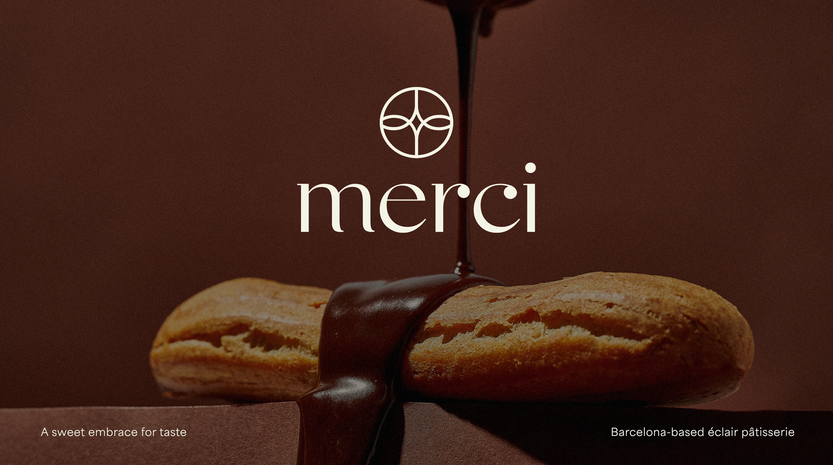
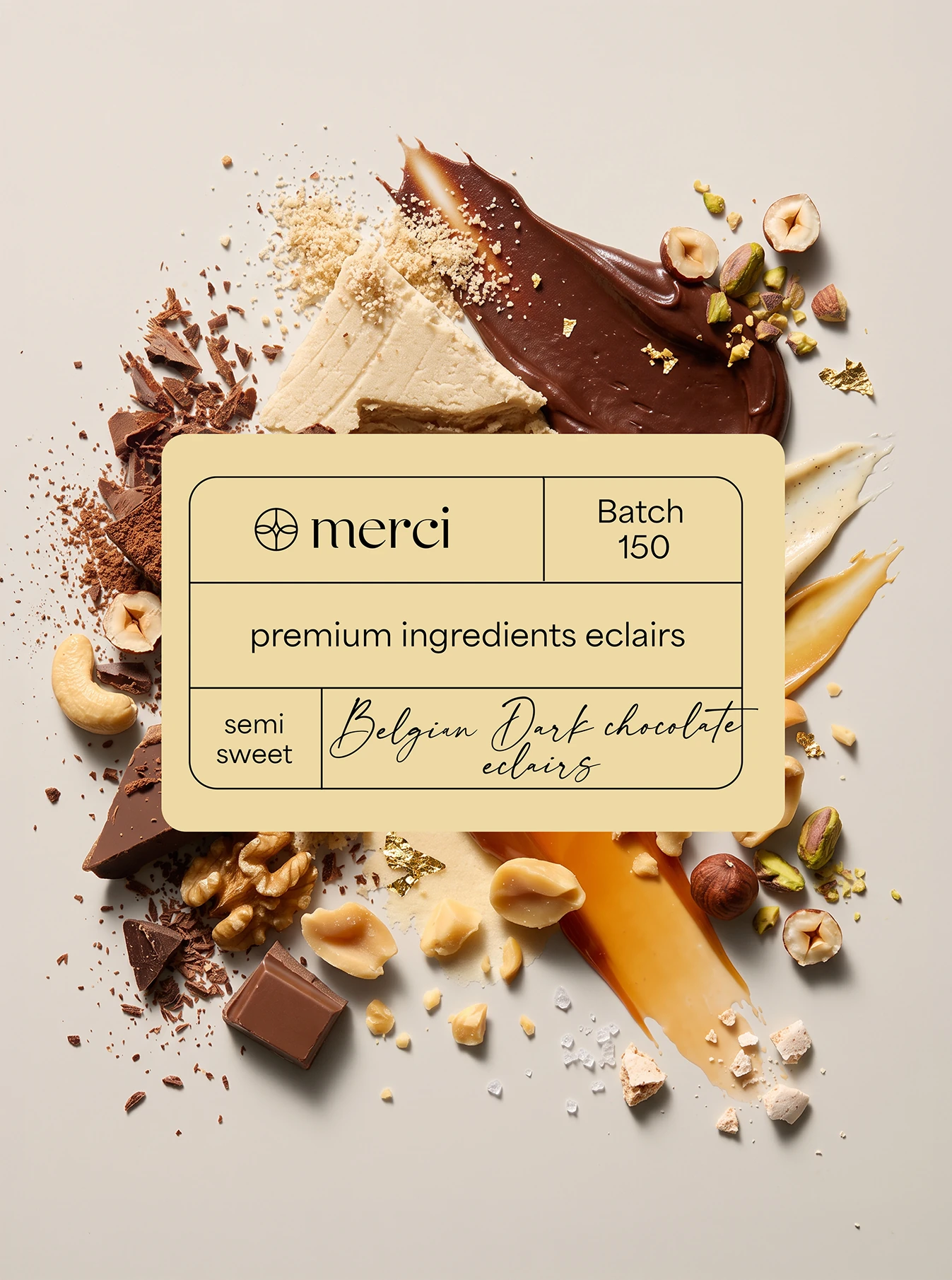
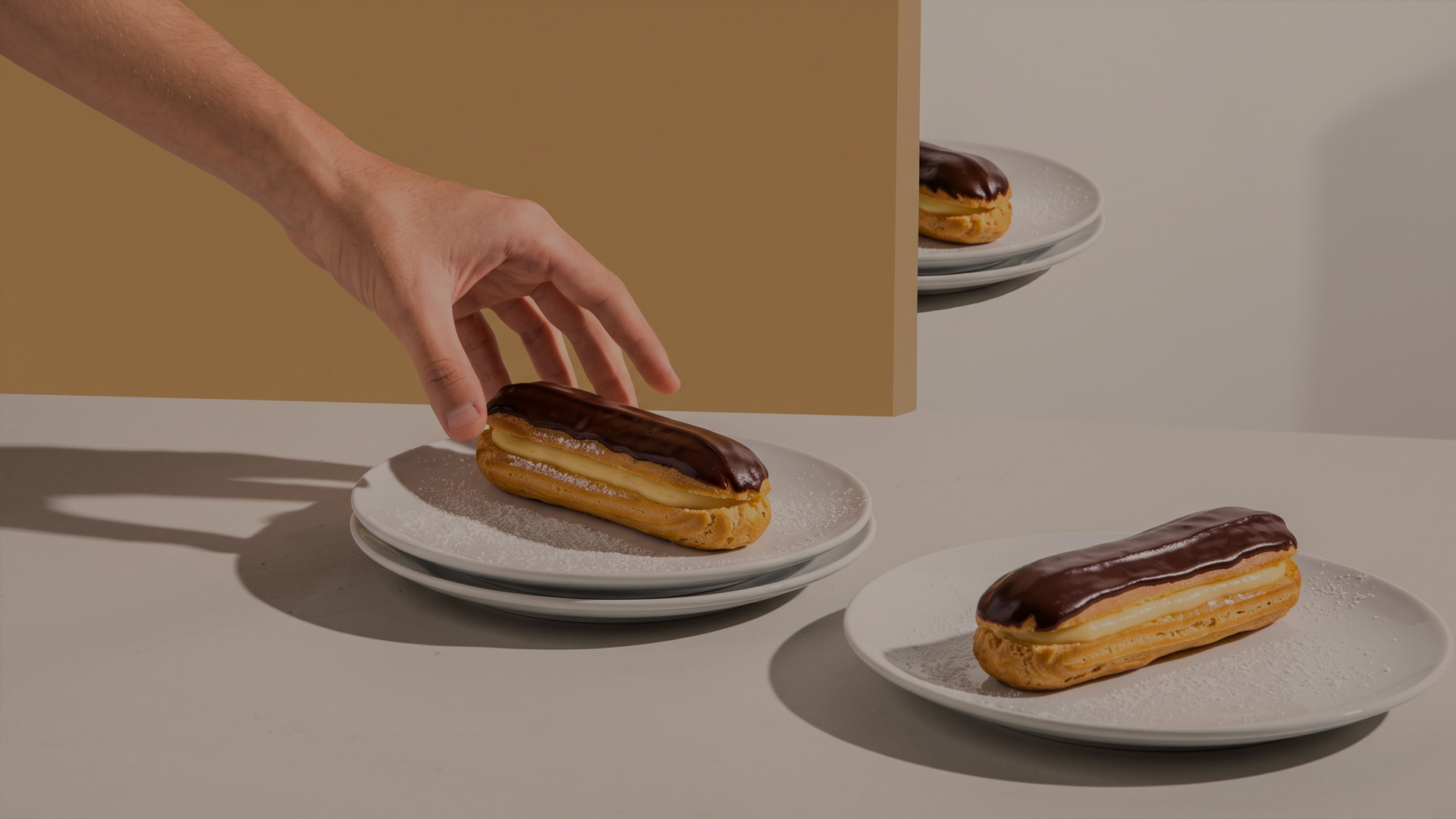
Merci is an éclair brand from Barcelona built around a quieter take on indulgence. With a focus on craftsmanship, high-quality ingredients and refined flavours, the idea was to create a premium experience that feels considered and approachable rather than extravagant.
The challenge was to translate that philosophy into a brand that could feel distinctly connected to Barcelona while keeping the calm, minimal character at the heart of Merci.
The Solution
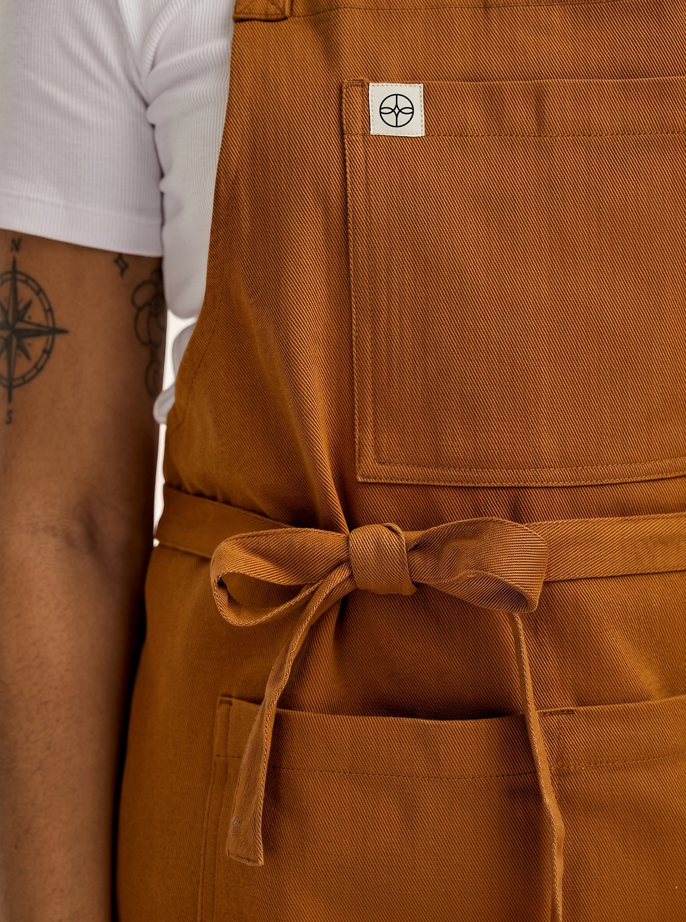
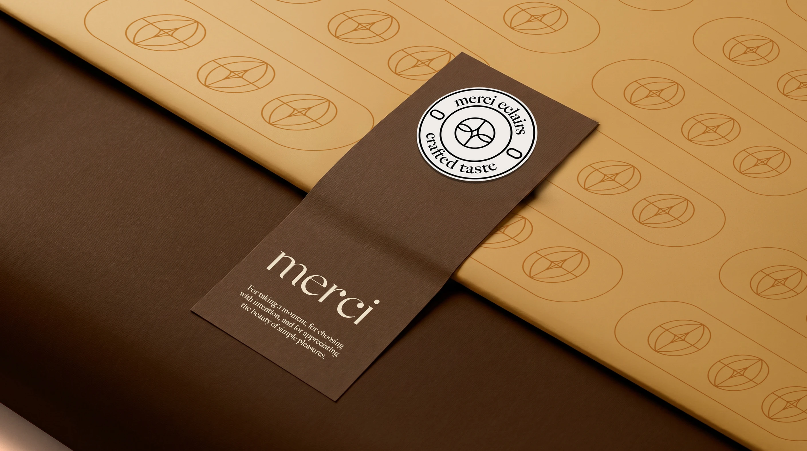
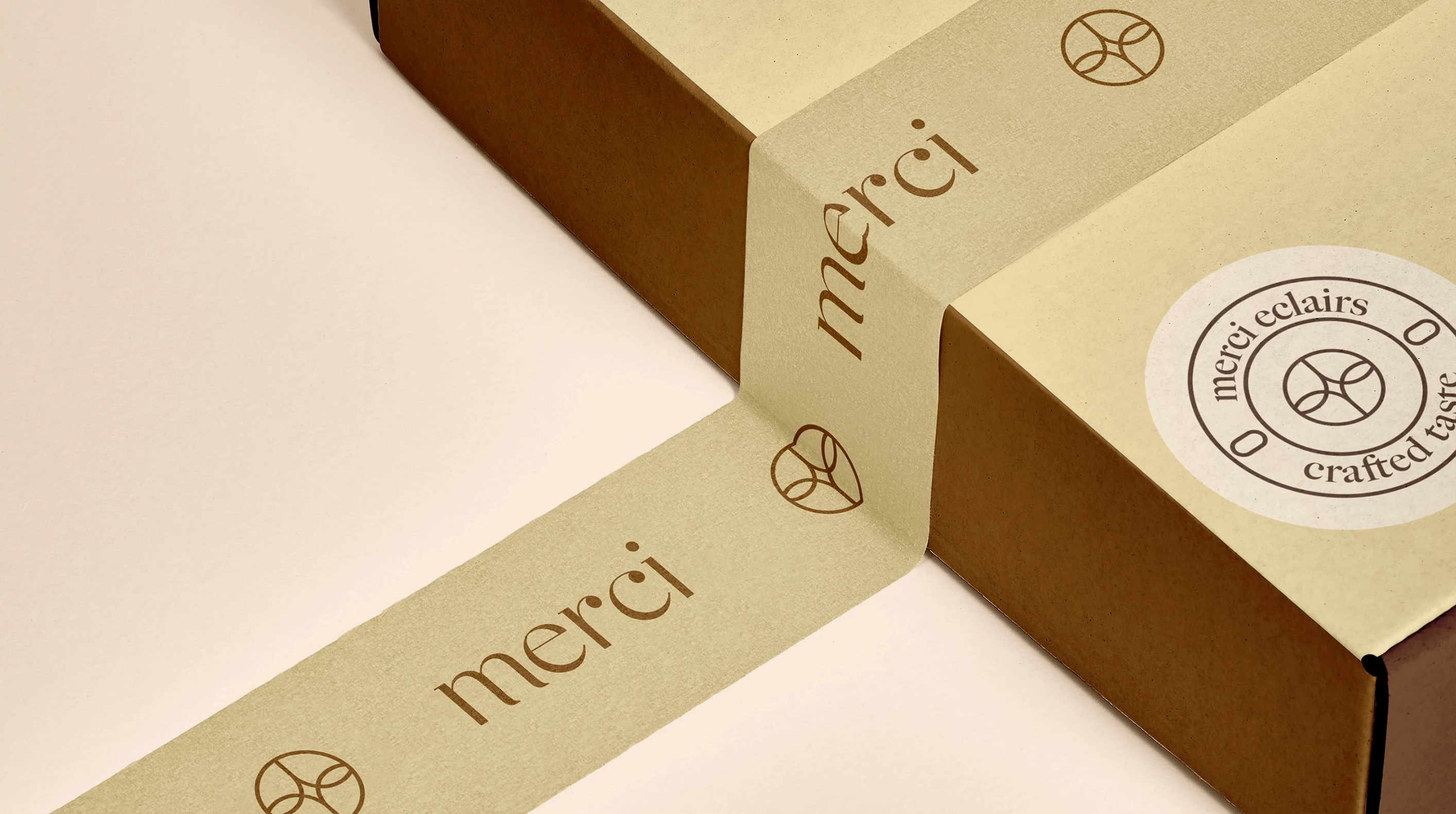
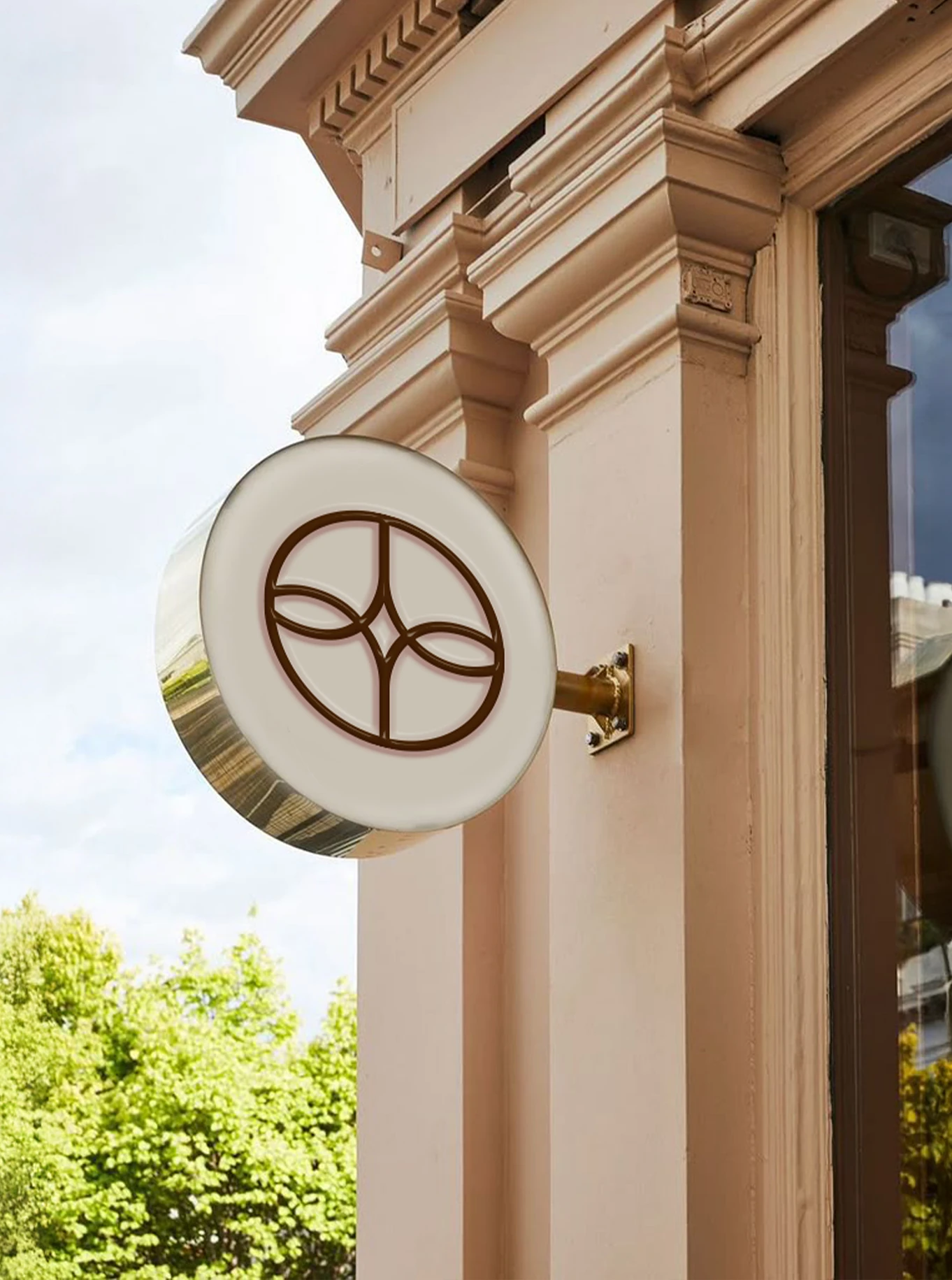
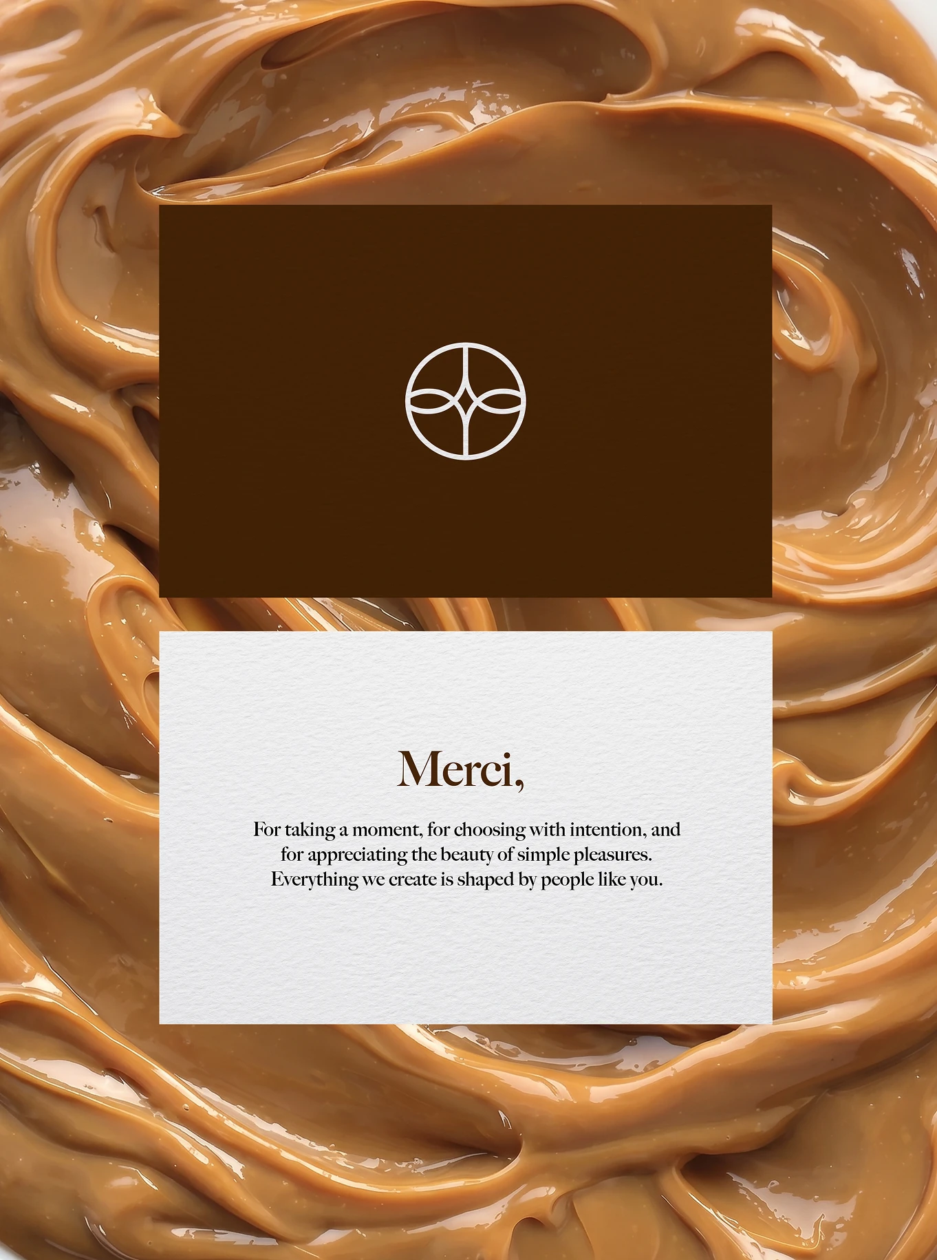
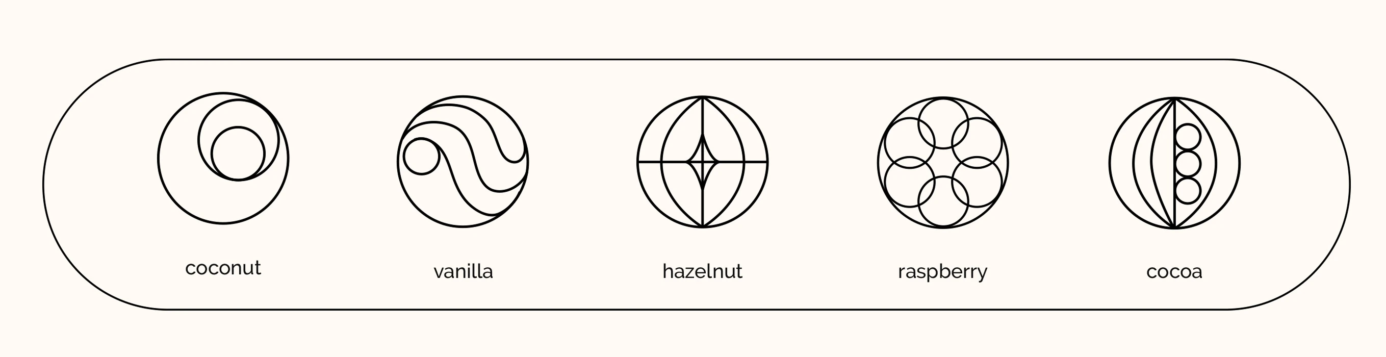
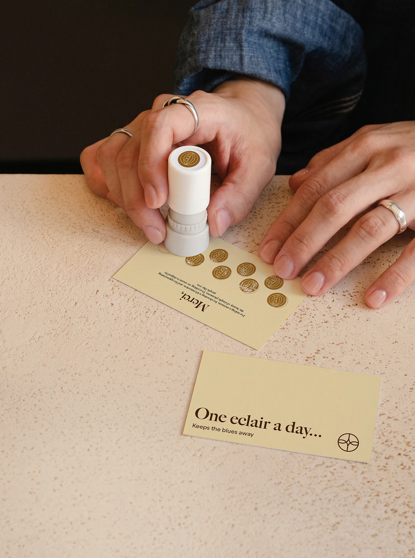
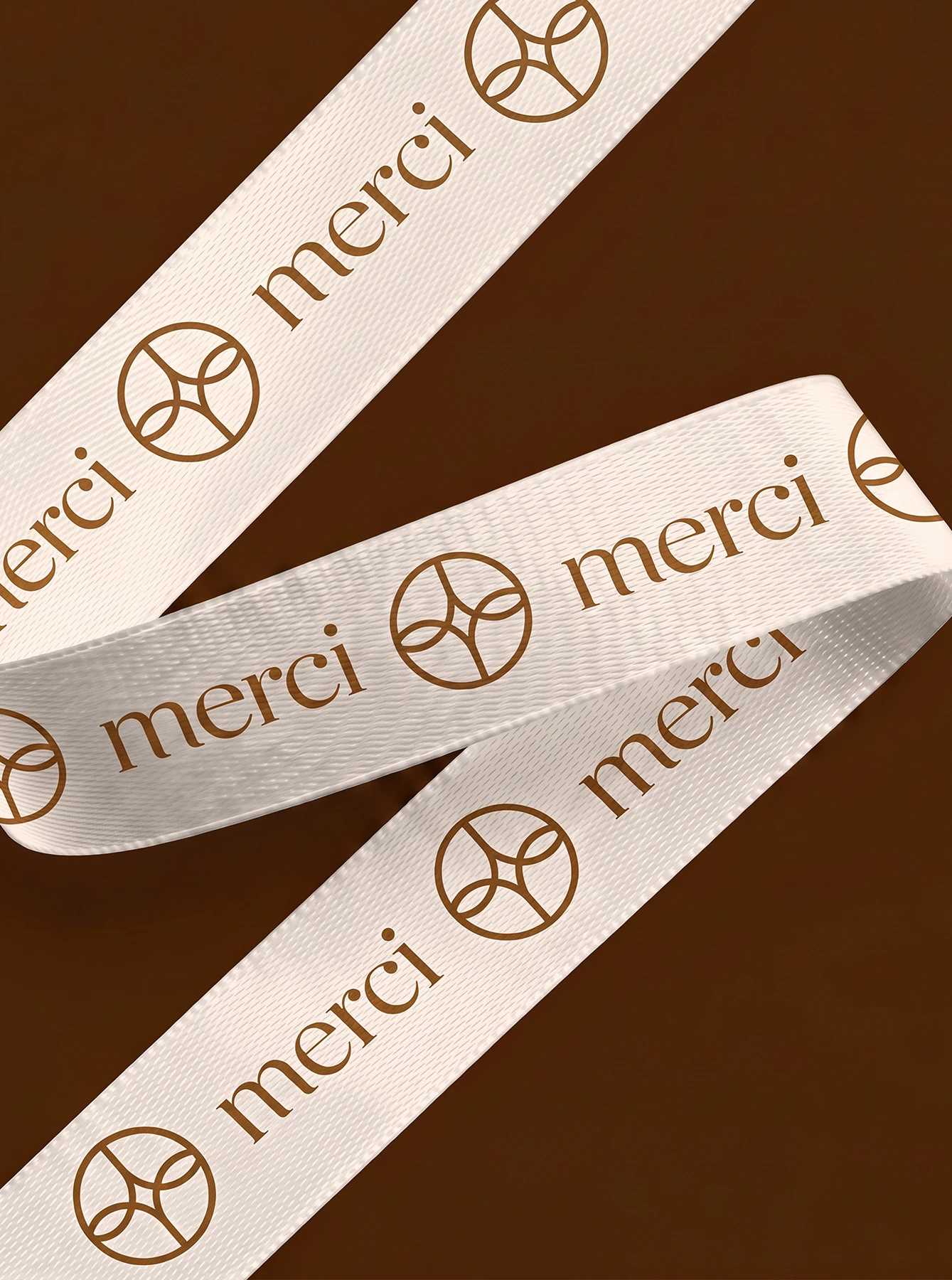
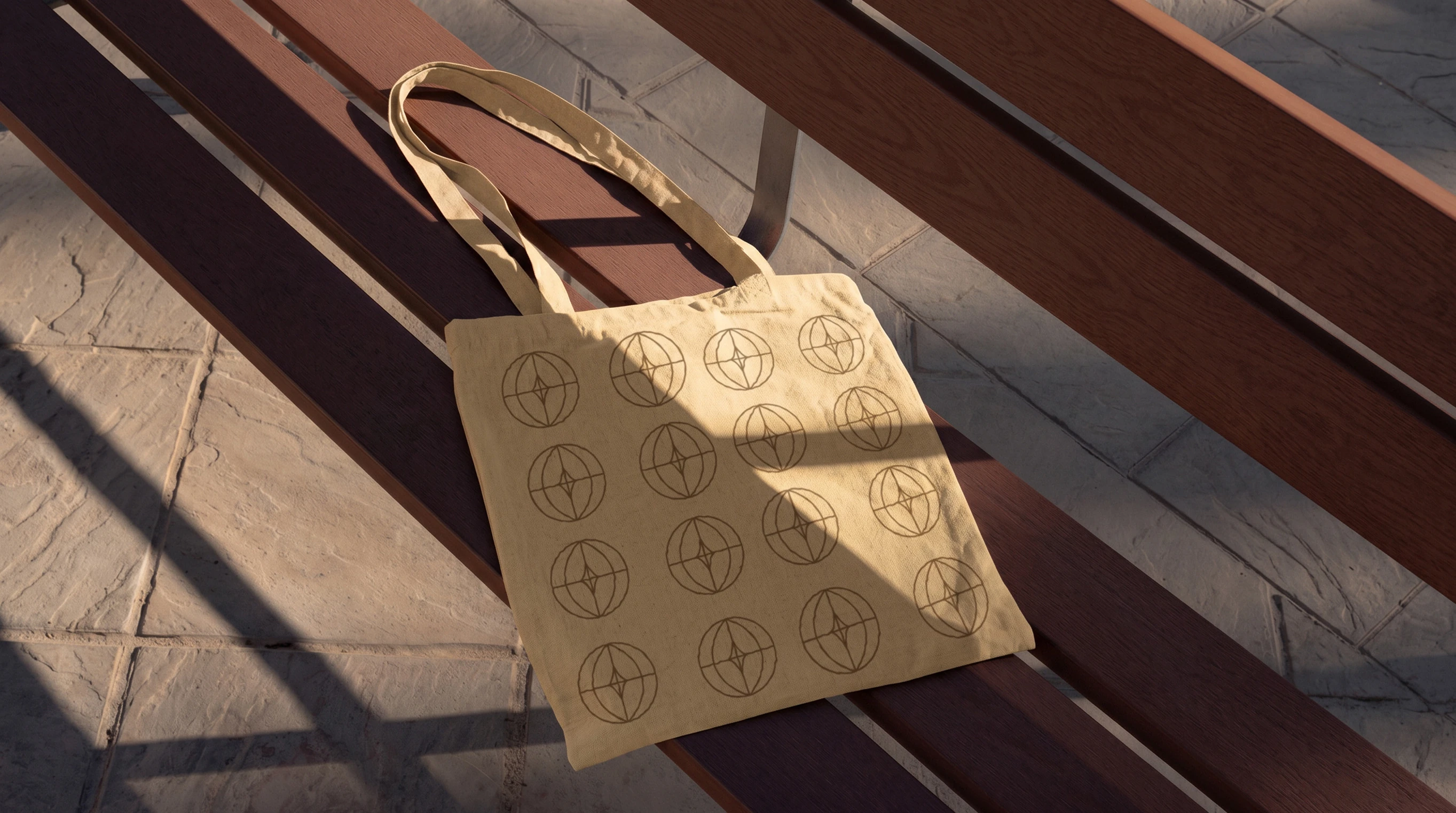
We built the identity around a symbol that brings together three parts of the Merci story. The letter M forms the foundation of the mark, a star at its centre represents craftsmanship, while the surrounding geometry takes inspiration from Barcelona’s stained glass windows.
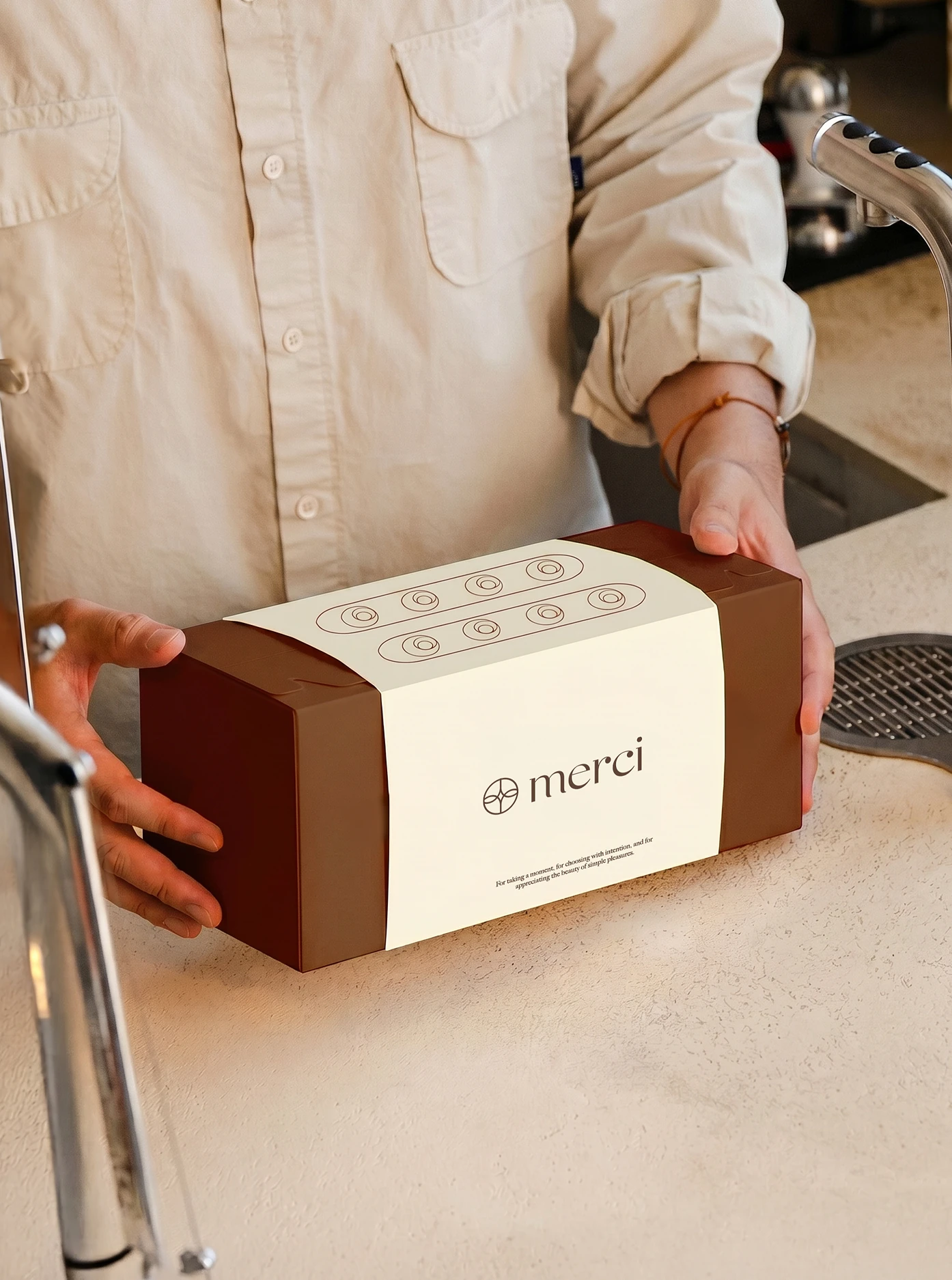
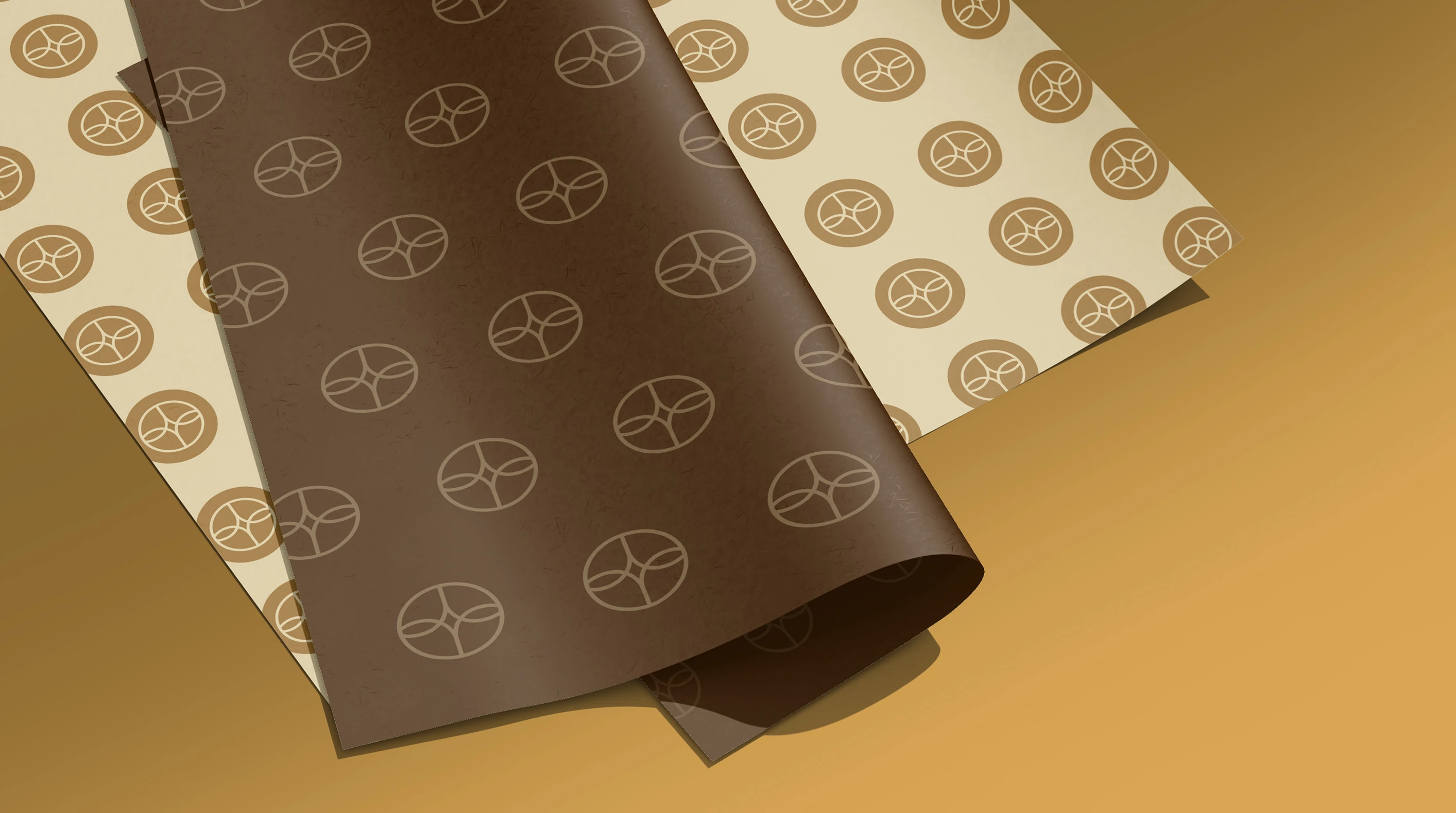
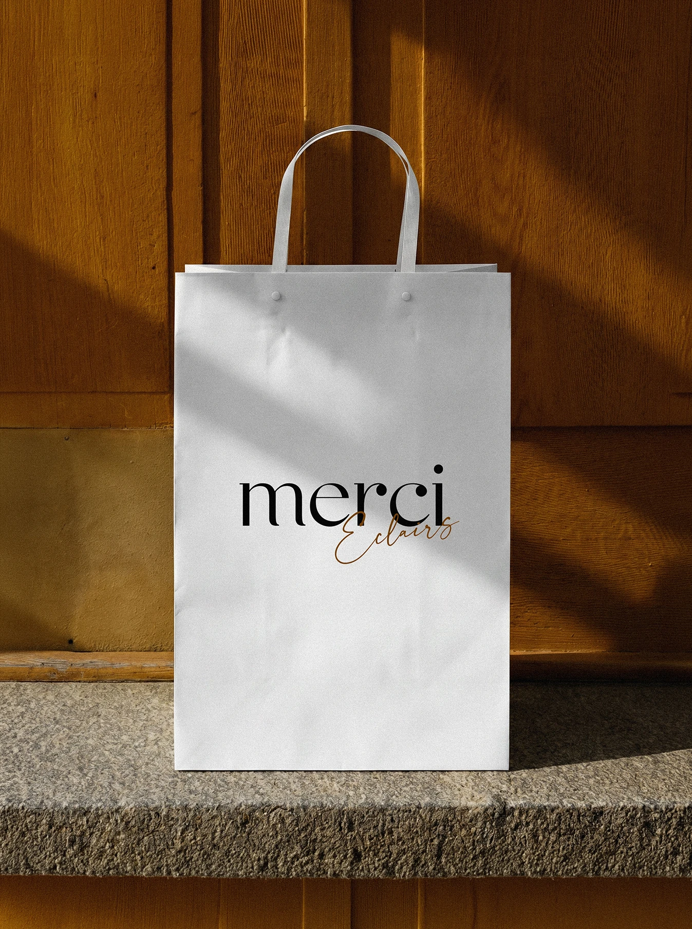
That idea extends into a restrained visual system where typography, warm tones and generous space let the product take the lead. The result is an identity that feels refined without becoming pretentious.